[ Scroll ↓ ]
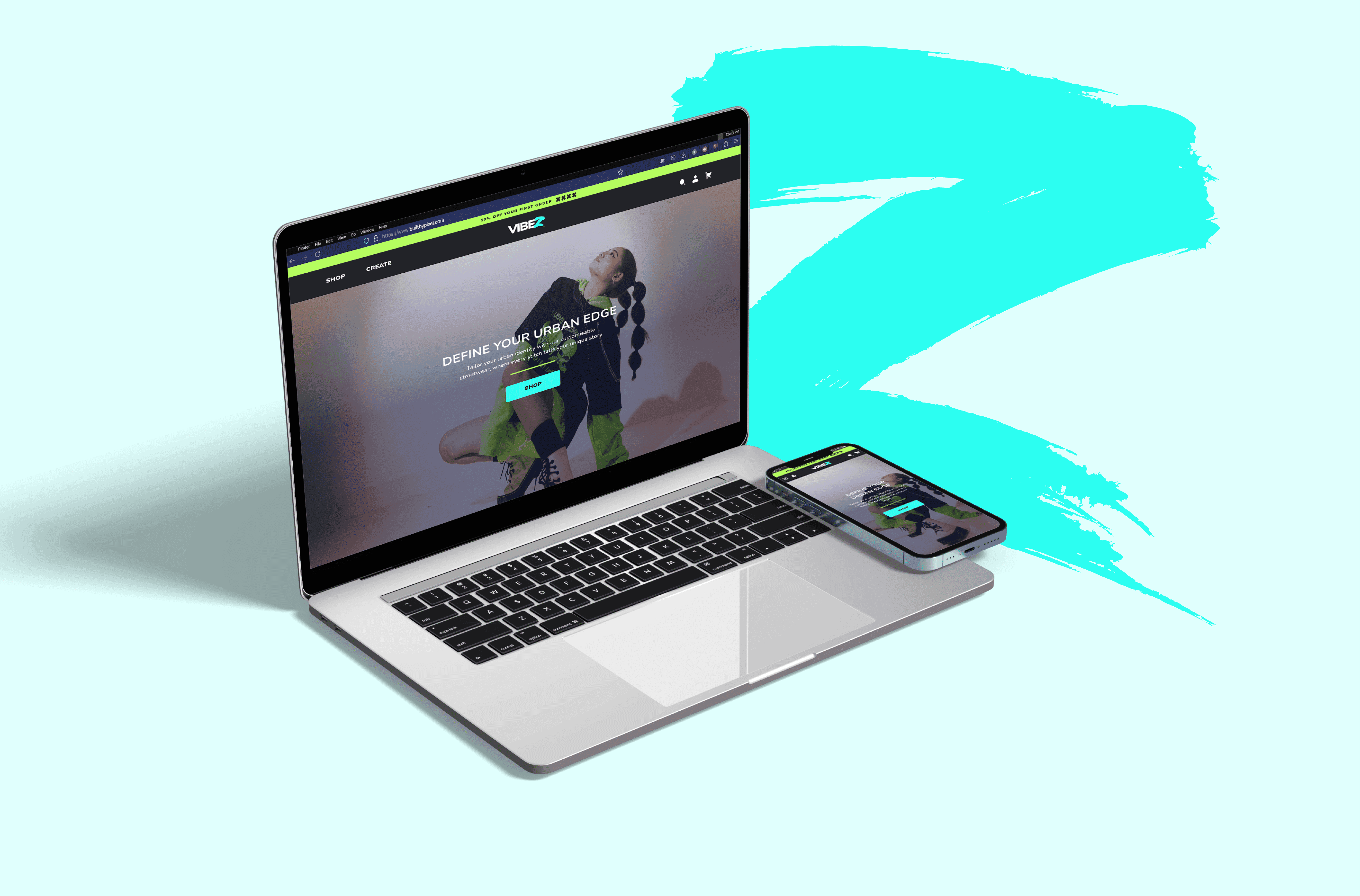
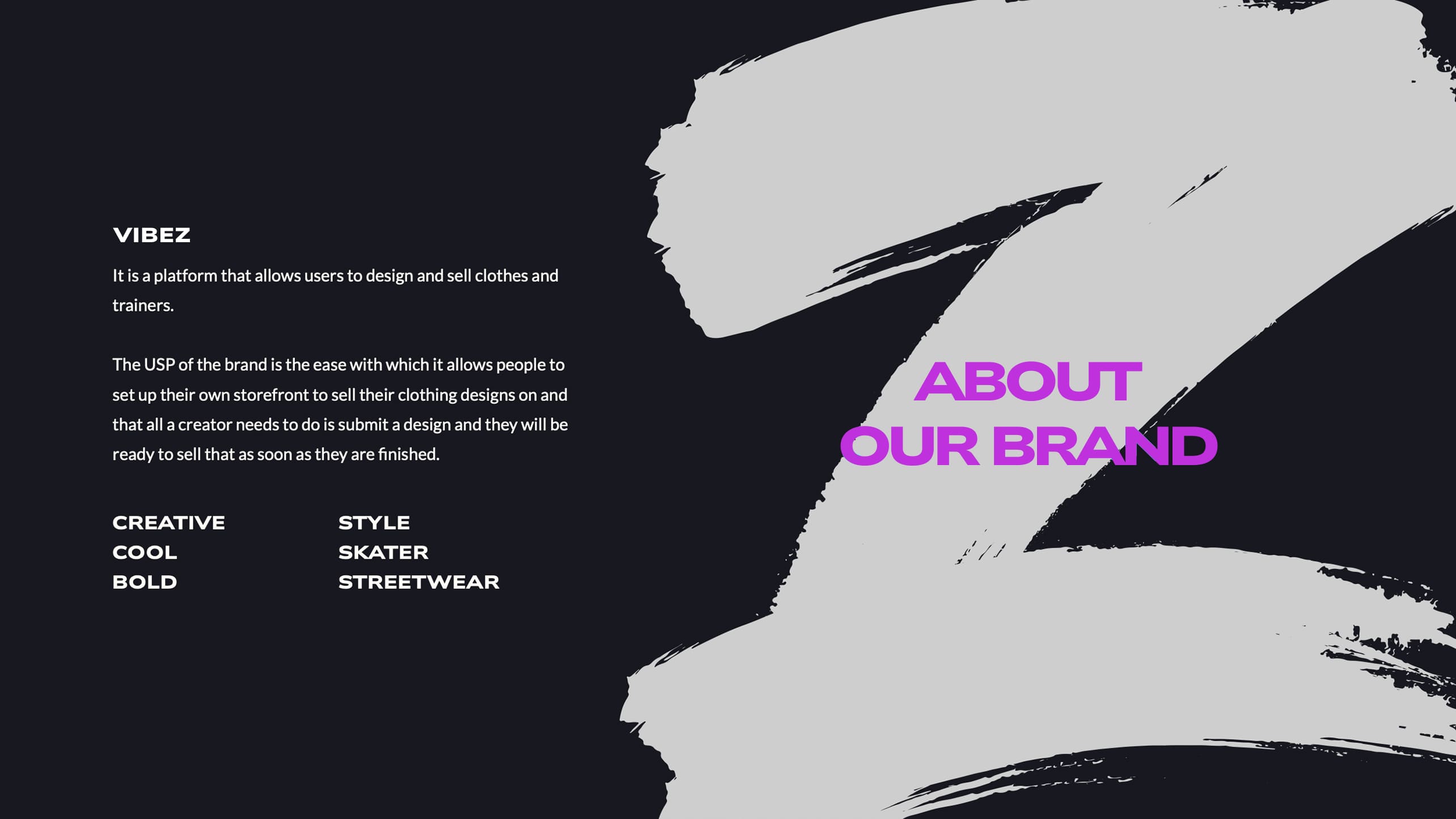
Vibez – Creators to Consumers
Project Duration
15/05/2024 - 10/06/2024
My Role
Product Designer
Share
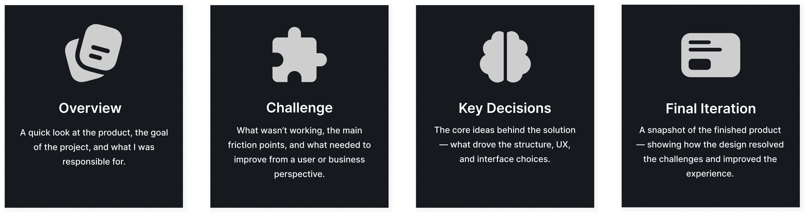
My Process
Every project is different, but I try to follow these guidelines if time constraints allow, depending on the goals, problems to be solved, and available resources.

Project Brief
Vibez is a next-gen eCommerce and creator platform built for youth culture. Users can either shop curated streetwear or design and sell their own garments via an integrated creation tool. I led the end-to-end product design, crafting a bold, responsive experience that caters to two entirely different user journeys, while maintaining a unified visual identity.
High Level Impact
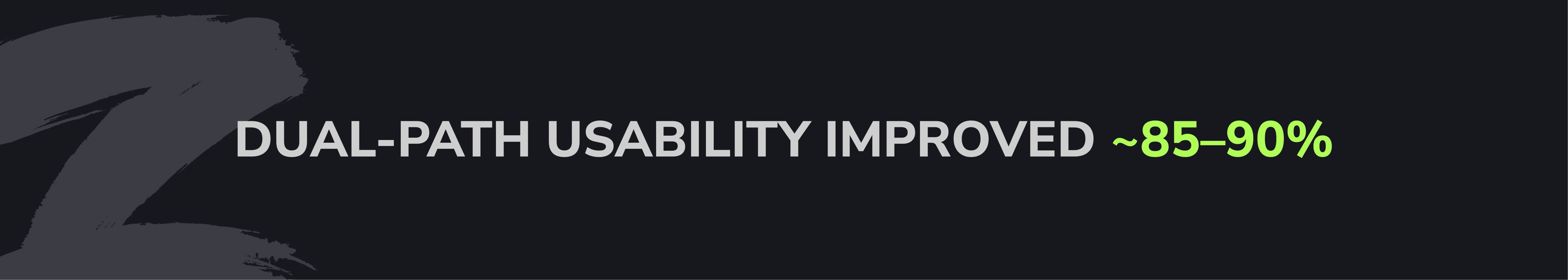
Initial testing revealed users struggled with the platform’s dual-path model. After refining the experience, comprehension of the creator path jumped from 10% to 90%, and exploration of the creator account option rose from 0% to 80%, successfully driving conversions.
The Goal
To design a bold, Gen Z–focused fashion platform that empowers both shoppers and creators. The aim was to merge a high-impact visual identity with intuitive UX, making complex eCommerce and custom garment creation feel simple, fast, and fun.
Key objectives:
Create two seamless user journeys: shopping vs. selling.
Design a customisation flow that balances creativity with clarity.
Ensure brand boldness doesn't compromise accessibility or usability.
Deliver a punchy, responsive experience across mobile and desktop.

The Problem
Modern fashion platforms either cater to buyers or creators, rarely both. Vibez set out to bridge this gap by offering a dual-path experience: one for shoppers, and another for aspiring fashion creators who want to design, sell, and manage their own products.
This presented major UX and branding challenges from day one.
The client’s brief:
A bold, urban visual identity, high contrast, vibrant colour palette, expressive typography
Full support for both traditional eCommerce and creator workflows
Integrated garment customisation, store setup, and sales management
Clear separation between creator and customer experiences, but within one platform
Key design challenges:
Dual User Roles: Balancing the needs of casual shoppers and advanced creators, each with different onboarding, dashboards, and tools.
Bold Brand vs. Usability: High-impact visuals had to be balanced with accessibility, legibility, and structure, especially for creator dashboards and mobile views.
Customization Complexity: Ensuring the garment design flow was creative yet user-friendly, supporting various sales models.
Content Moderation: Every custom product required approval, adding extra UX steps and logic to the publishing flow.
Gen Z Expectations: Users expected sleek, modern interactions that felt culturally relevant, without sacrificing clarity or speed.
[ Creator Account Login Flow ]
[ Creator Account Signup Flow ]
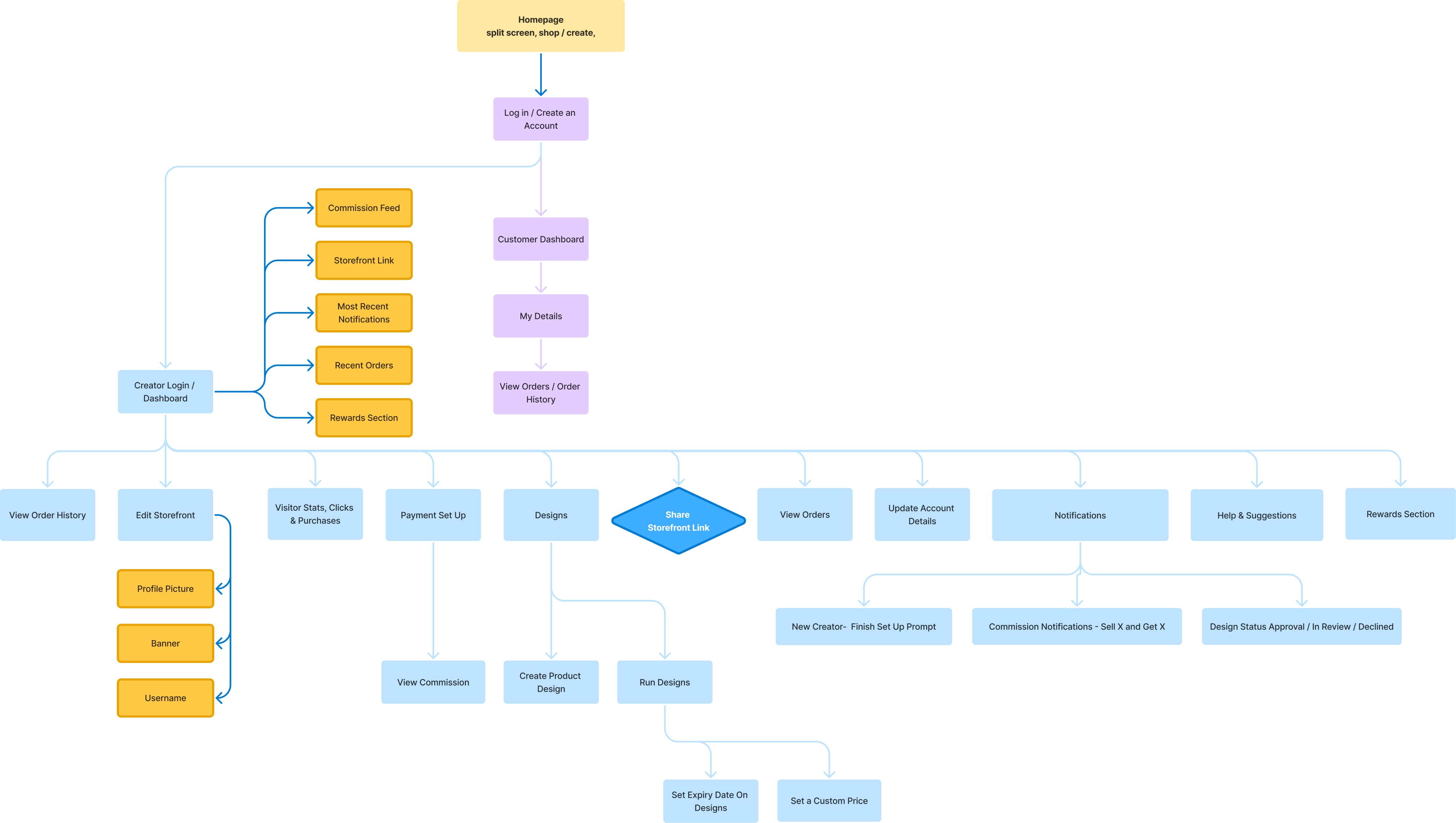
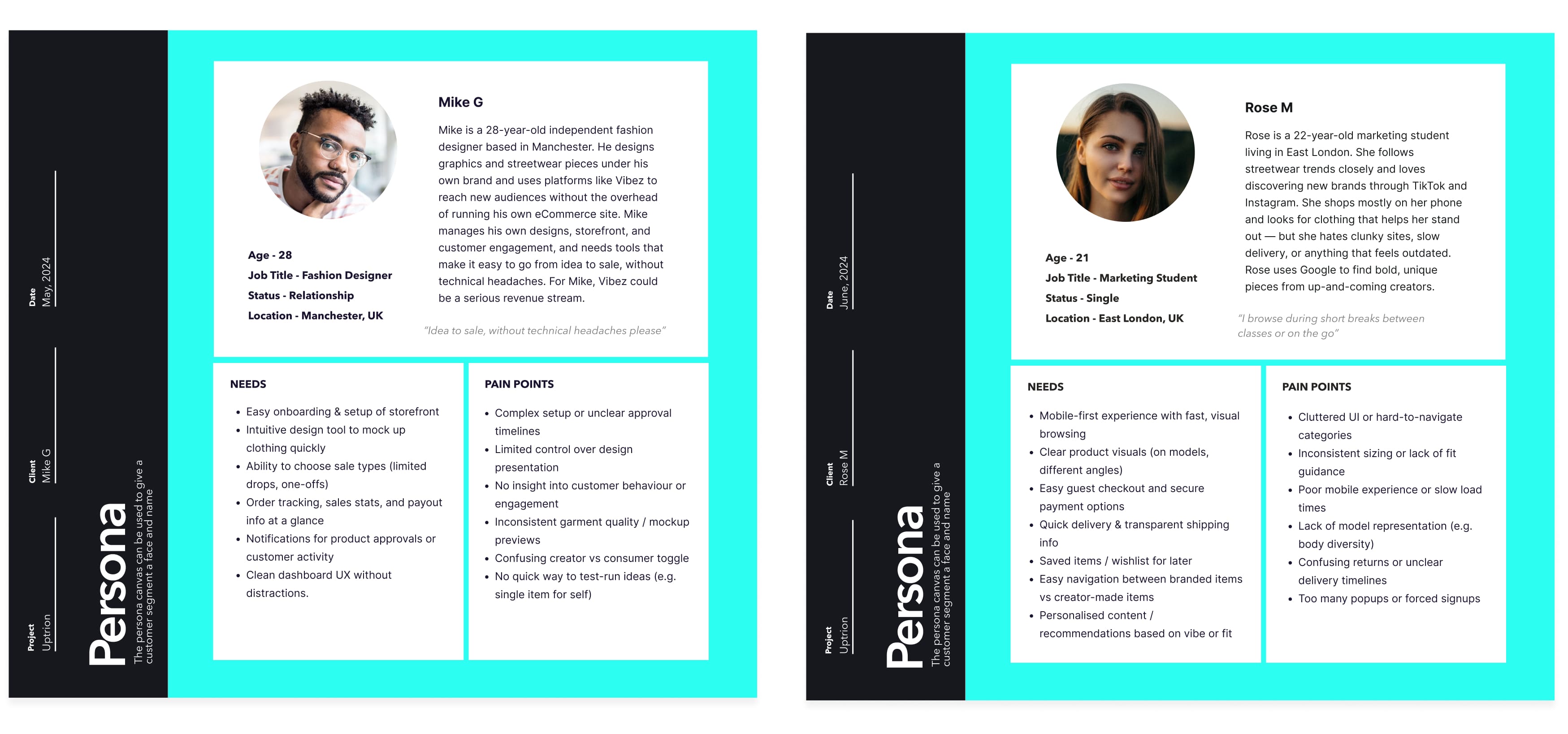
Understanding the Users
Before defining solutions, I developed user personas to reflect the key audience segments, primarily Gen Z shoppers and a broader creator range aged 21–45. These personas informed interface decisions, content tone, and flow structure across the platform.
Defining the Foundations
Before moving into high-impact visuals, we mapped out key user flows through low-fidelity wireframes. This allowed us to validate onboarding, dashboards, and the garment customisation process for both creators and shoppers.
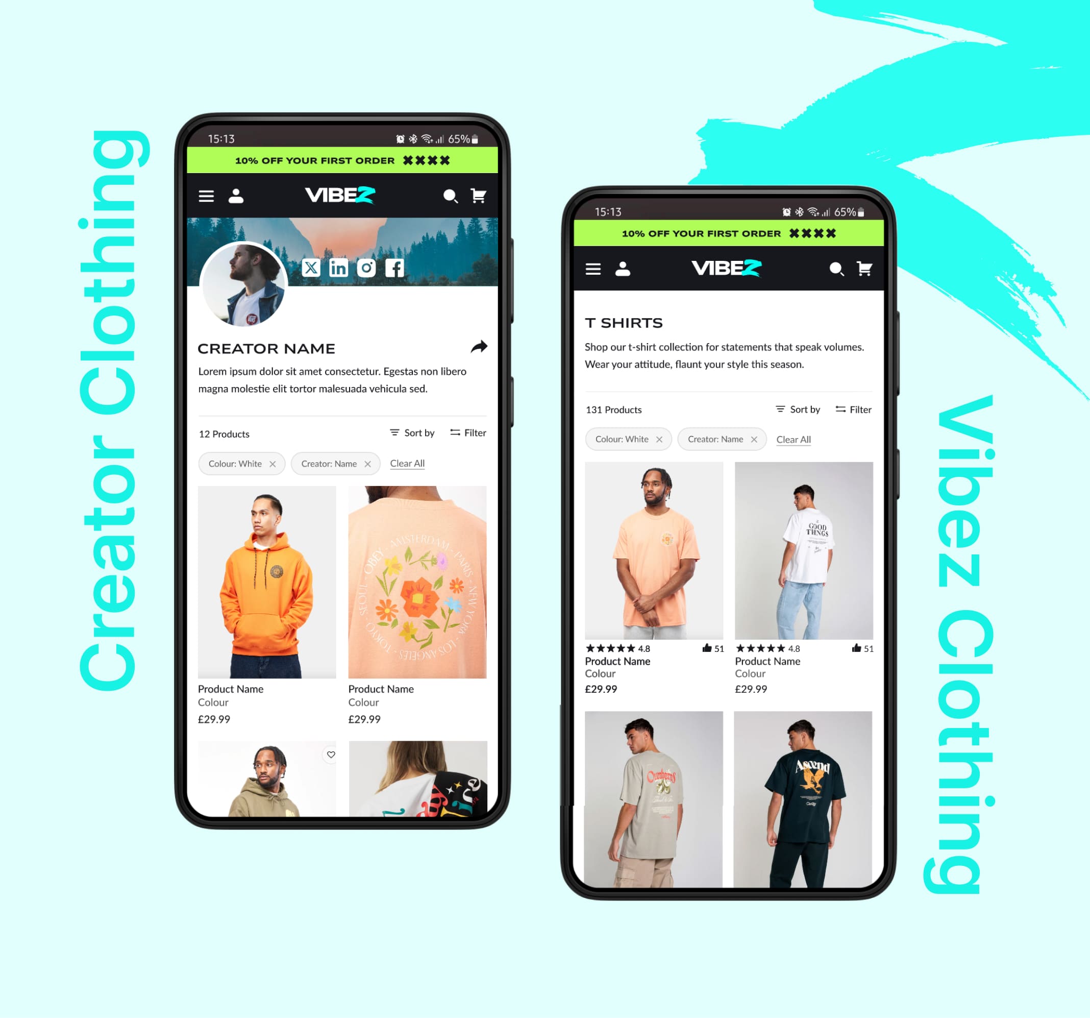
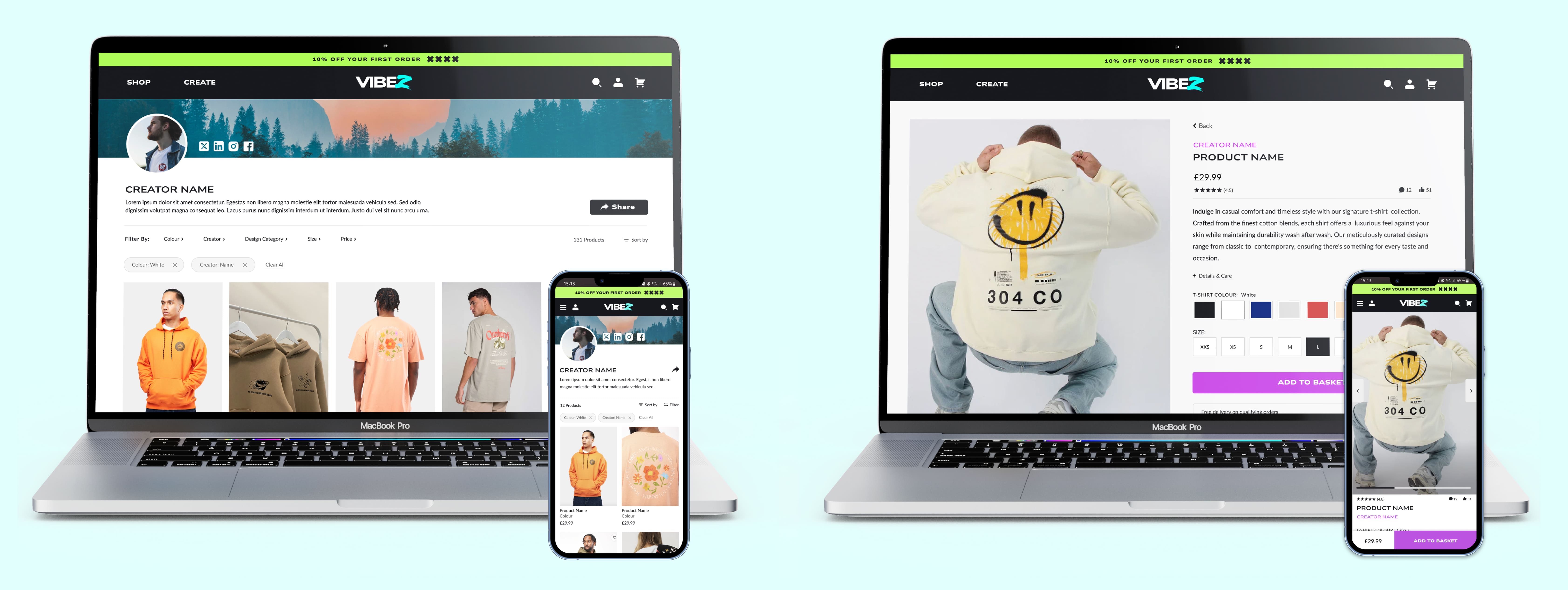
Creator Pages vs. Vibez Collections
Problem:
During testing, users struggled to understand the difference between Vibez-branded products and creator-made products. The layouts felt too similar, making it unclear when they were viewing an official collection versus a creator’s personal storefront.
Solution:
We separated the two experiences visually and structurally:
Vibez-branded clothing uses a polished, editorial layout with campaign imagery and curated collections.
Creator storefronts feel more personal and modular, featuring creator bios, profile images, and flexible layouts that highlight individuality and user-generated designs.
This distinction helped users instantly recognise which type of product they were browsing without adding friction to the shopping journey.
[ Comparison ]
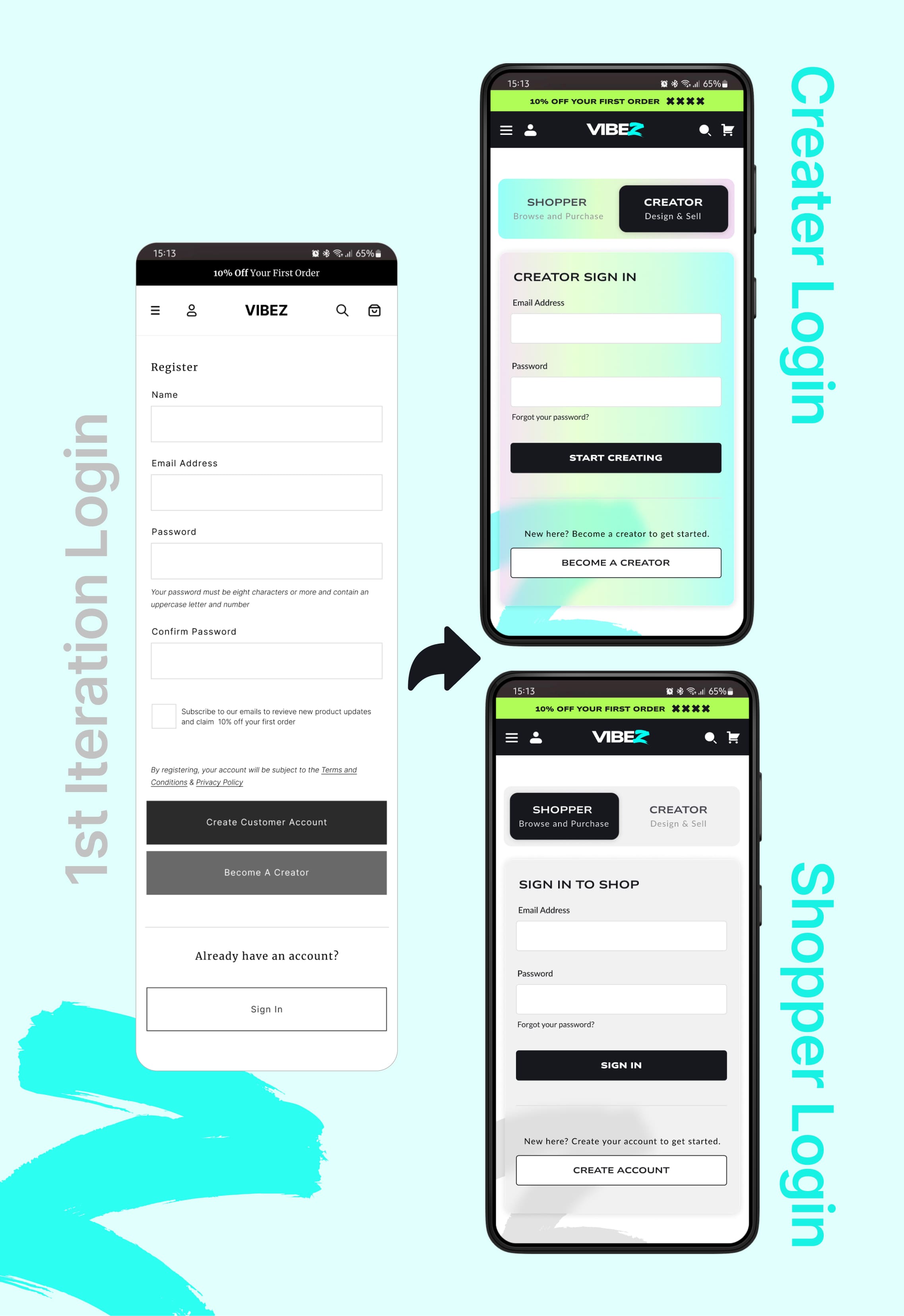
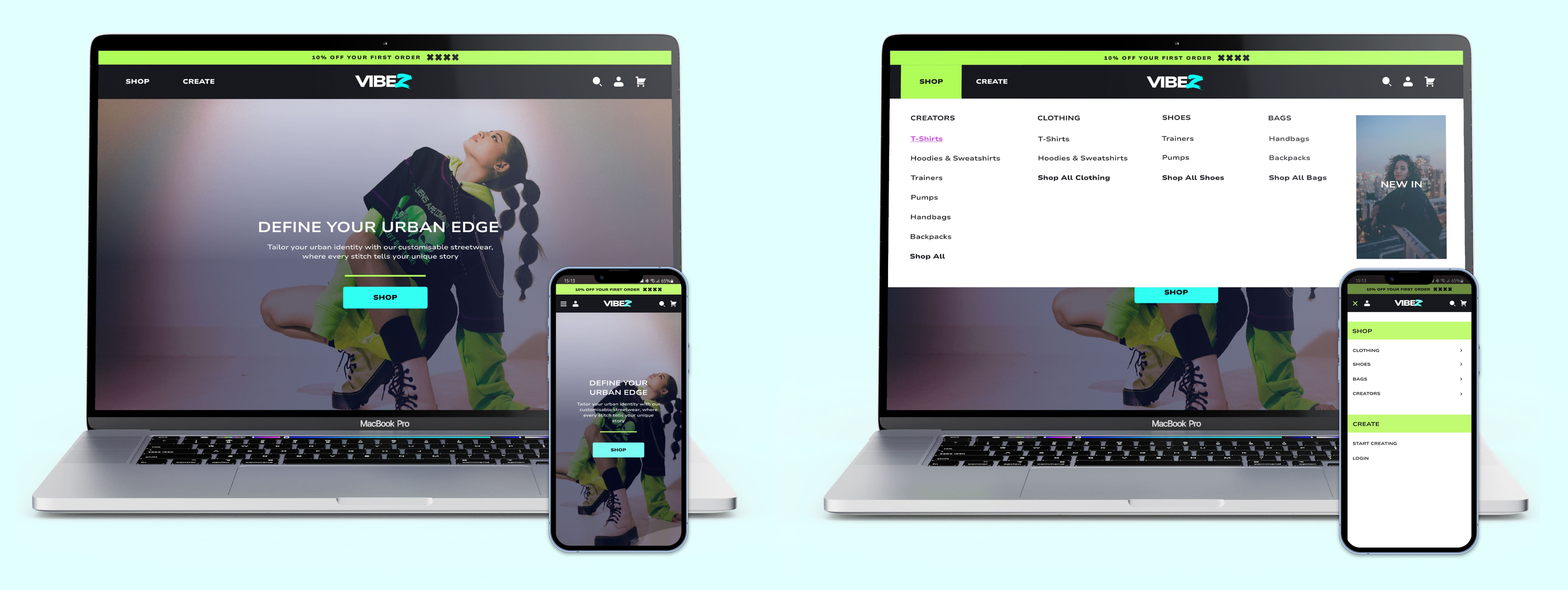
Making the Shopper vs. Creator Paths Clear
Problem:
The first wireframes showed two CTAs - Create Customer Account and Become a Creator. Users couldn’t tell the difference, and the login page didn’t reinforce which path they were on. Testers repeatedly asked whether they were signing up as a shopper, a creator, or both.
Solution:
I replaced the dual CTAs with a tabbed slider on the sign-in page:
Shopper — Browse and purchase
Creator — Design and sell
Switching tabs also triggers a visual theme change:
Creator → multicoloured, energetic
Shopper → calm, neutral grey
These cues were carried into the user’s profile welcome banner, making each mode immediately recognisable.
[ Comparison ]
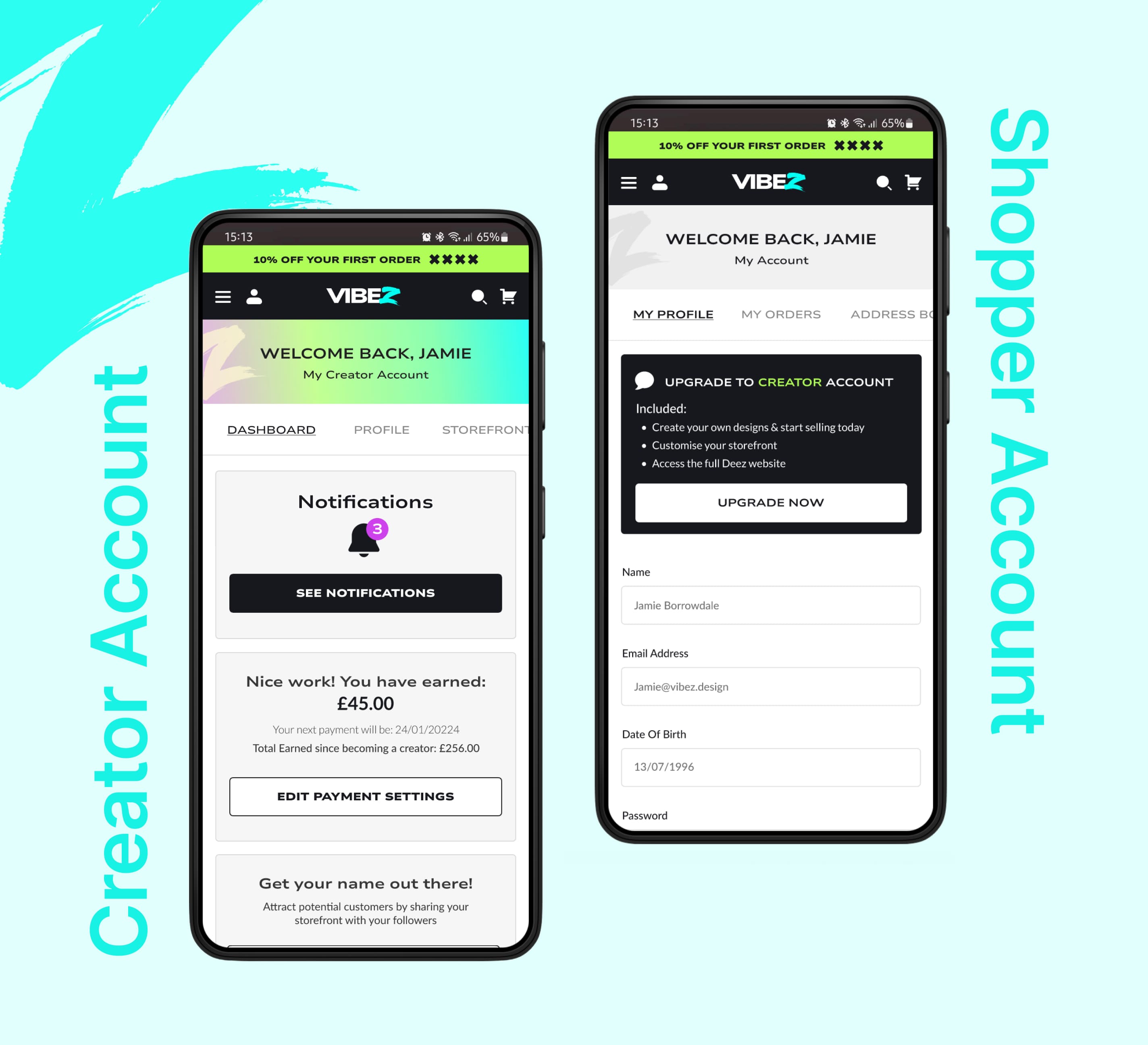
[ Creator & Shopper Dash ]
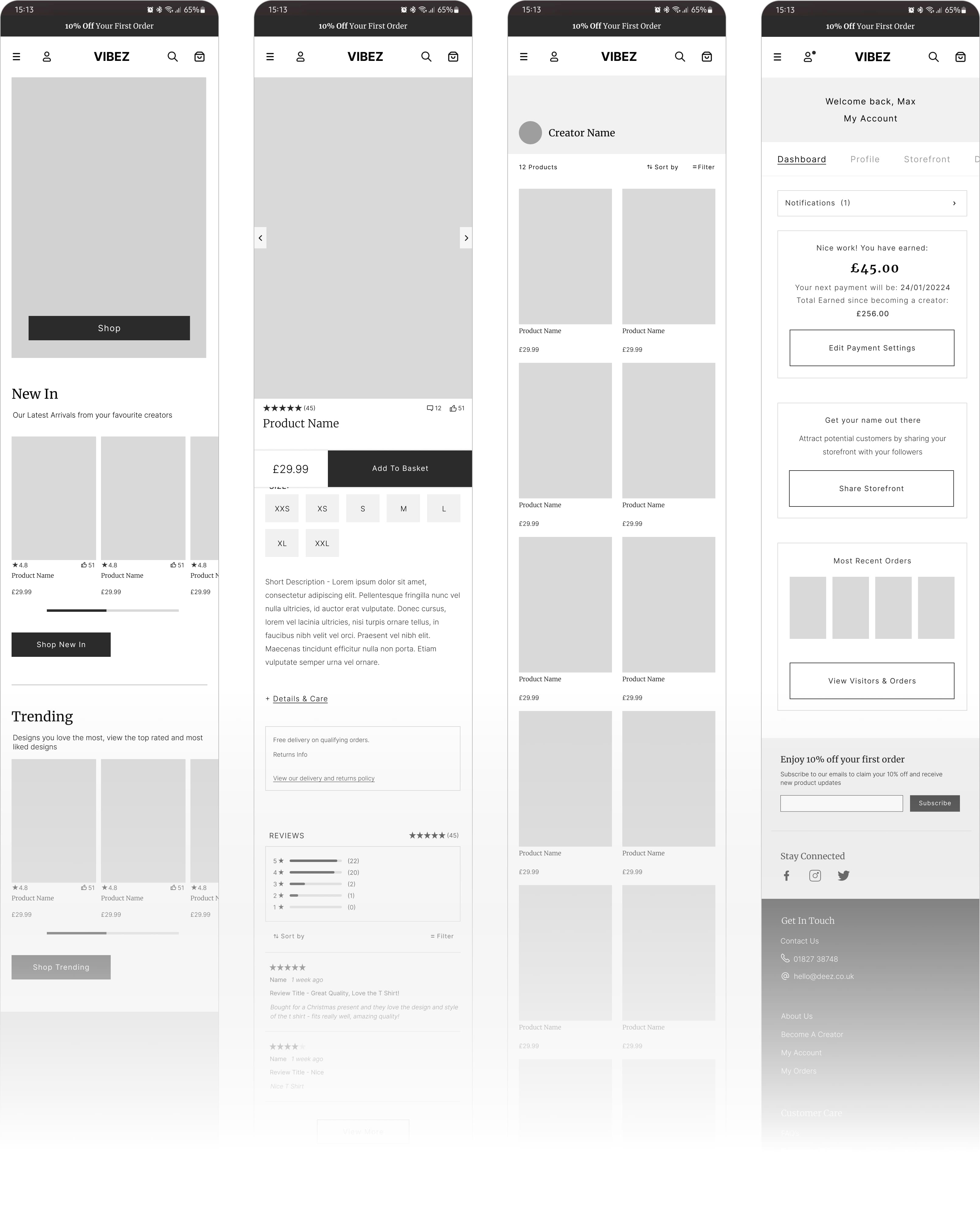
Dashboard design split interfaces between shopper and creator, giving creators access to storefronts, notifications, stats, and orders, while shoppers retained a more traditional eCommerce experience.
Helping Users Understand the Creator Journey
Problem:
Clicking “Become a Creator” threw users straight into the flow (uploading a logo, choosing products, etc.). Testers had no context and felt lost from the first step.
Solution:
I added a dedicated Creator Introduction page before the onboarding begins.
This page quickly explains:
What being a creator means
How the process works
What they’ll be doing next
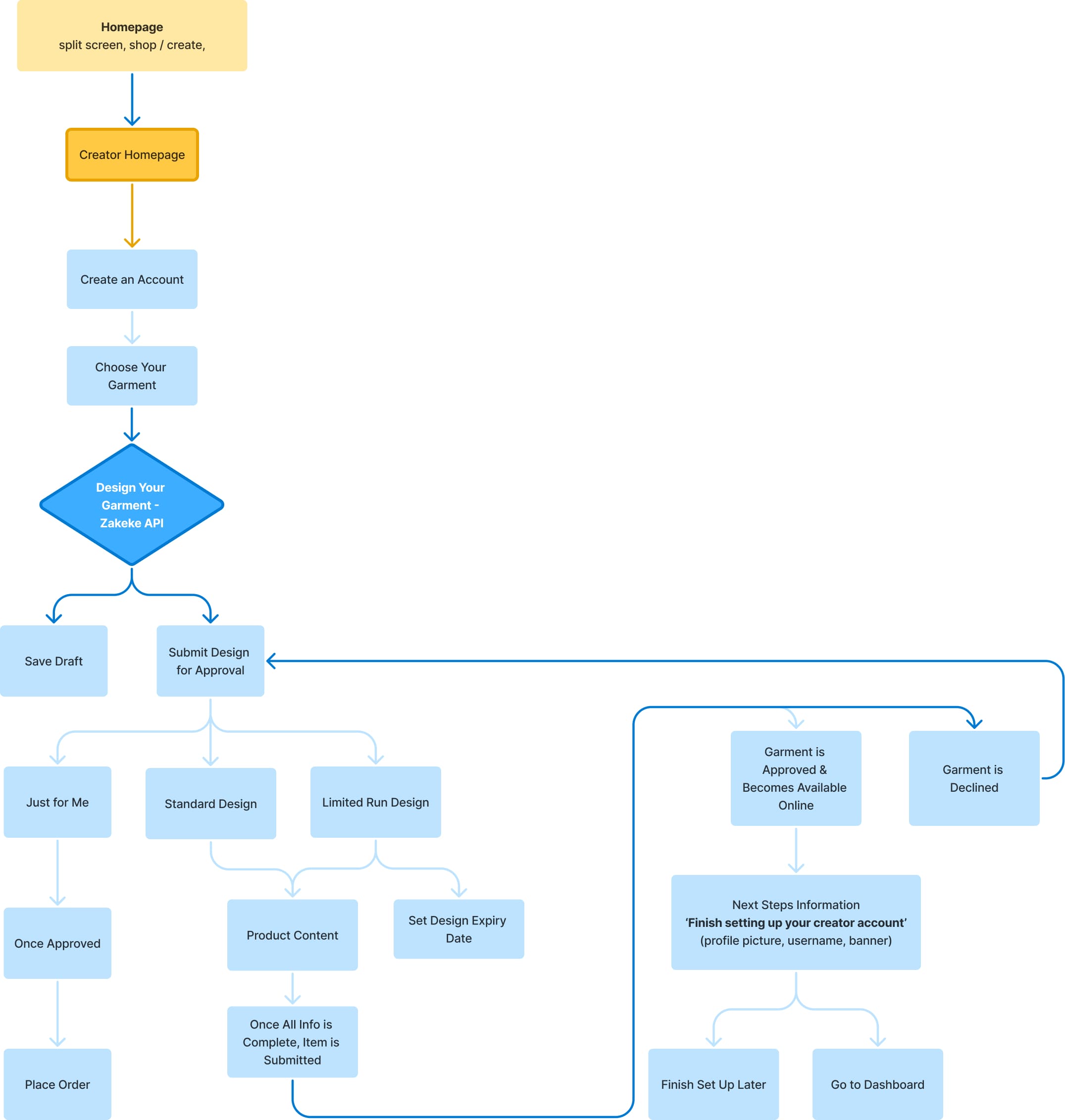
Only then do users move into registration and the design process. The garment design step itself is handled through an integrated API called Zakeke, which allows creators to customise products seamlessly within the onboarding flow.
[ Creator Sign Up ]
Microinteractions
I crafted motion elements and microinteractions that provide clear, responsive feedback without visual noise, including hover states, animated upload confirmations, and smooth page transitions. These subtle touches enhance usability while giving the platform a polished, modern edge that aligns with user expectations, (particularly gen z).
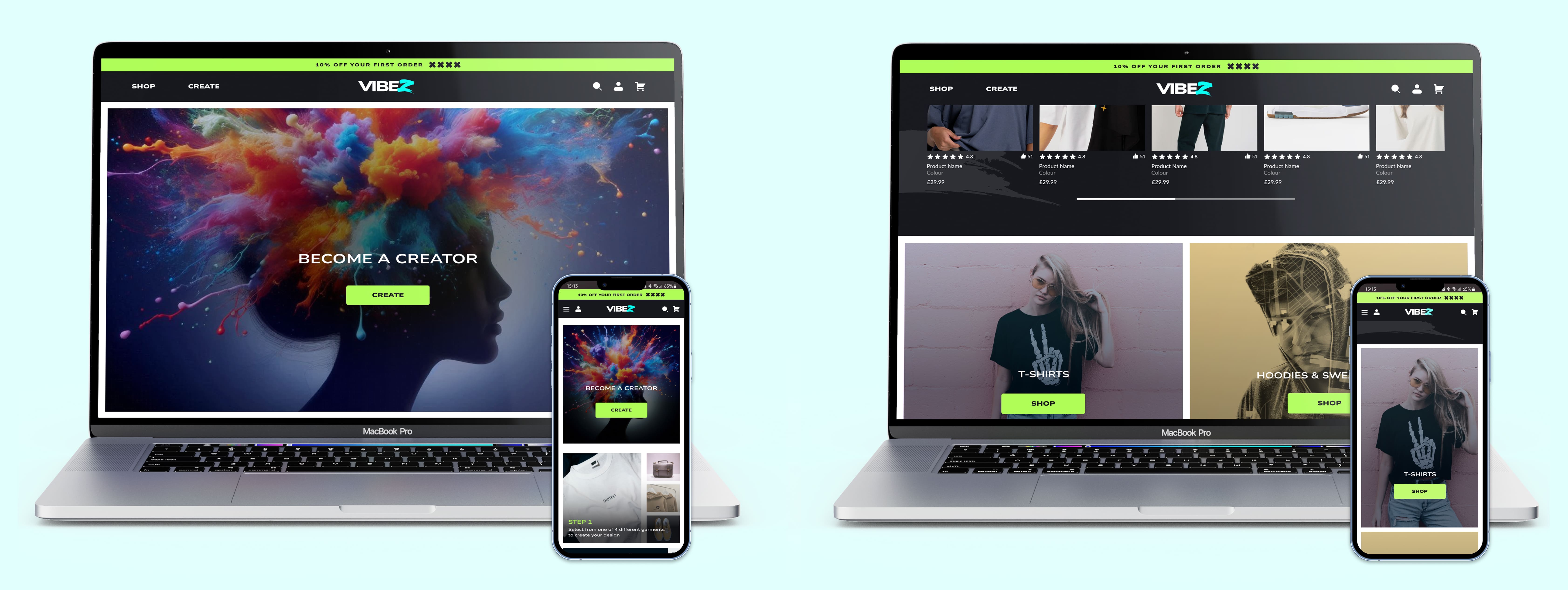
[ Desktop Homepage ]

Impact
After the updates, comprehension of the creator path rose from 10% to 95%. Users could clearly distinguish the two experiences, understand what being a creator entailed, and navigate the process with confidence. This resulted in smoother navigation, fewer blockers, and far more informed decision-making.
Additionally, users with shopper accounts explored the creator account option far more frequently, increasing from 0% in early iterations to 80% in the final design, successfully driving the intended conversion to creator accounts.
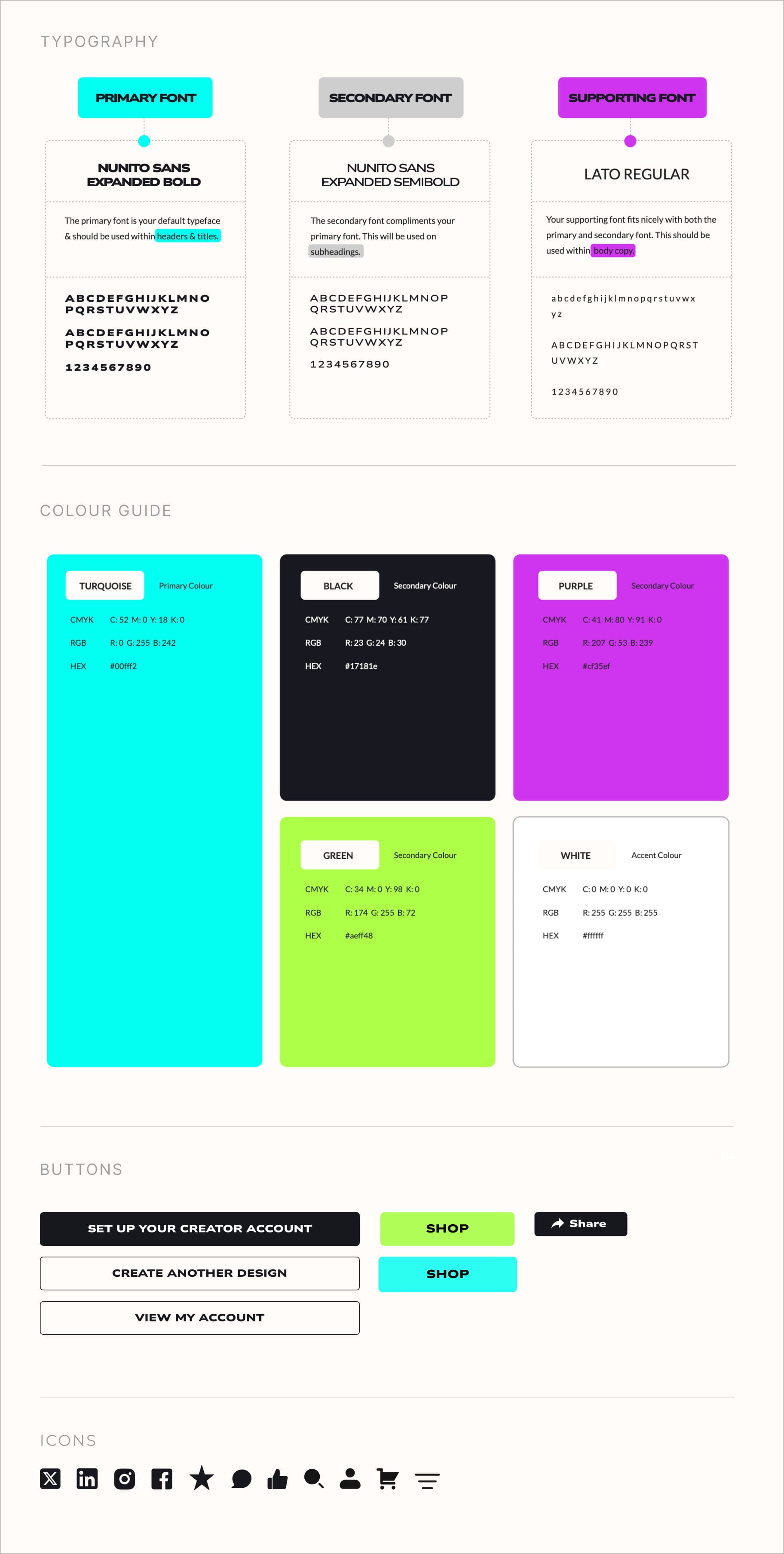
Style Guide
I was asked to follow a bold, expressive style guide for this project, which was creatively exciting but also challenging. With most colors and typography preselected by the client, I focused on maintaining usability by ensuring WCAG AA accessibility standards were met, including strong contrast, clear typography, and accessible navigation.
To support the brand’s urban tone while remaining accessible, I carefully balanced contrast, typography, whitespace, and motion, preserving visual energy without creating clutter.
Responsive Design
While approximately 85% of users tested reported browsing for clothes on mobile, 60% of sales are typically finalised on desktop devices, a trend observed across global competitors like ASOS, according to Google metrics. With this in mind, Vibez was designed responsively from the ground up. Creator tools and dashboards were specifically optimized for desktop, where design and content creation feel more intuitive. Ensuring both the mobile and desktop experiences felt cohesive was key to the platform’s success.
What I learned
Vibez challenged me to balance expressive visual branding with complex dual-user UX. Designing for both shoppers and creators required building flexible systems that could scale while feeling distinct. It pushed me to think deeply about onboarding, role-based navigation, and how visual energy can coexist with clarity. I also sharpened my approach to interaction design, learning how to inject personality through motion without overwhelming the experience. Most importantly, it reinforced how strong UX can support bold ideas without compromising usability.
View Prototype →
View Prototype