[ Scroll ↓ ]
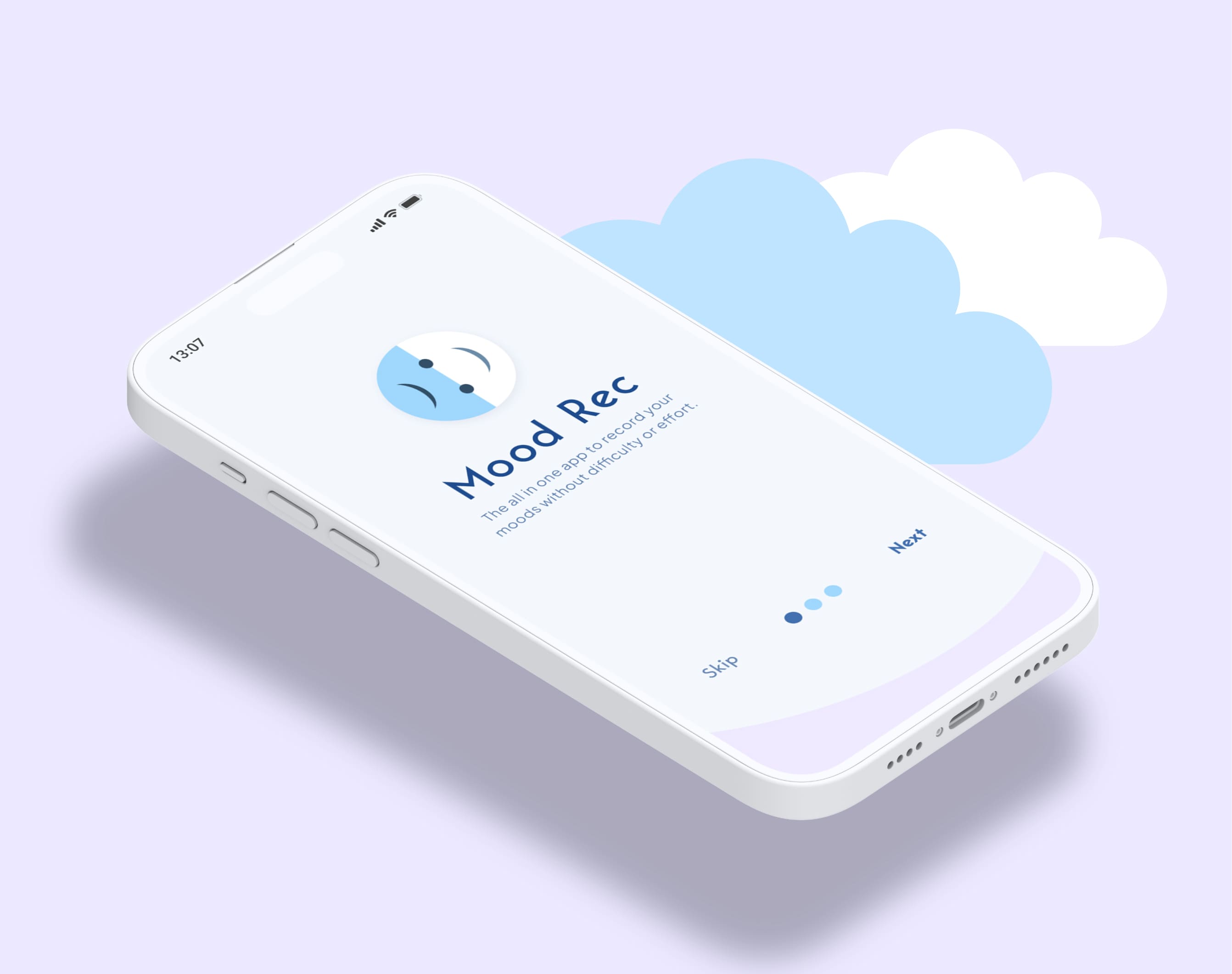
Mood Rec - Wellness App
Project Duration
02/12/2021 - 01/03/2022
My Role
Product Designer
Share
Project Overview
Mood Rec is an app that will provide a complete suite of services for people who would like to track their daily moods in order to expose patterns in their thinking. Some of the services will include a mood rating system, diary, mood data statistics, calendar and an audio wellness page.
Life can be difficult sometimes, and many peoples mental health has suffered more than usual during the COVID pandemic. For those who feel uncomfortable reaching out for help, an app like this can provide an alternate self-help solution.
The Problem
Many of the mood tracking wellness apps on the market currently only offer an expensive premium service with little to no free features, and/or do not provide users with unique solutions to help improve their mental health.
High Level Impact
Users struggled to log moods quickly and navigate the app efficiently. I redesigned the core flows to make the experience more intuitive, accessible, and engaging.

The Goal
The objective was to create a flexible, simple to use mood-tracking app that could be used for free with affordable, additional premium features. It would offer solutions to helping users understand negative patterns in their mood, and what to do about it.
Process
Every project is different and my process will continue to evolve. It will be determined by the goals of the project, the problem/problems that need to be solved, time and resources.
The process I used to solve this problem was as follows:
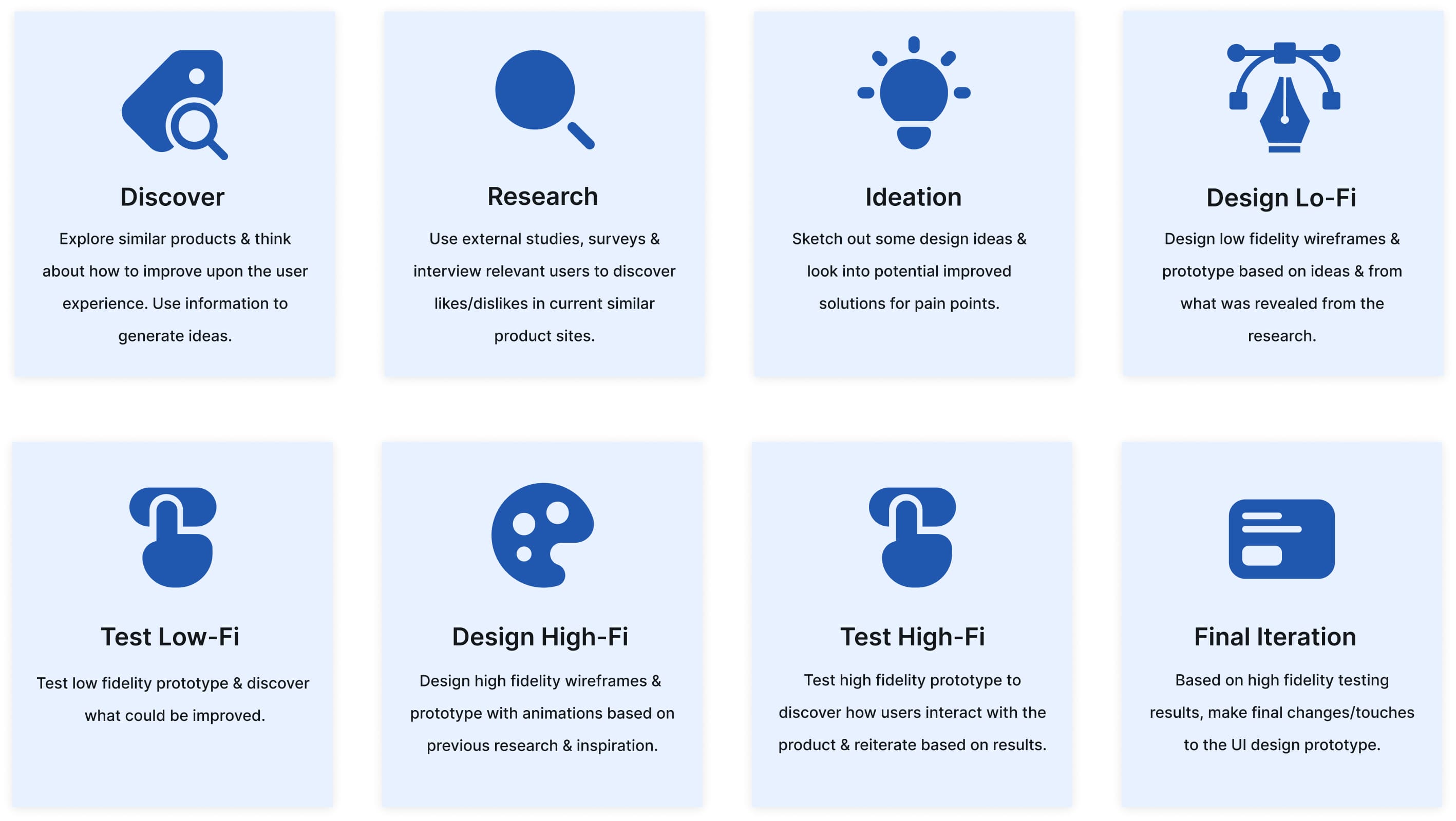

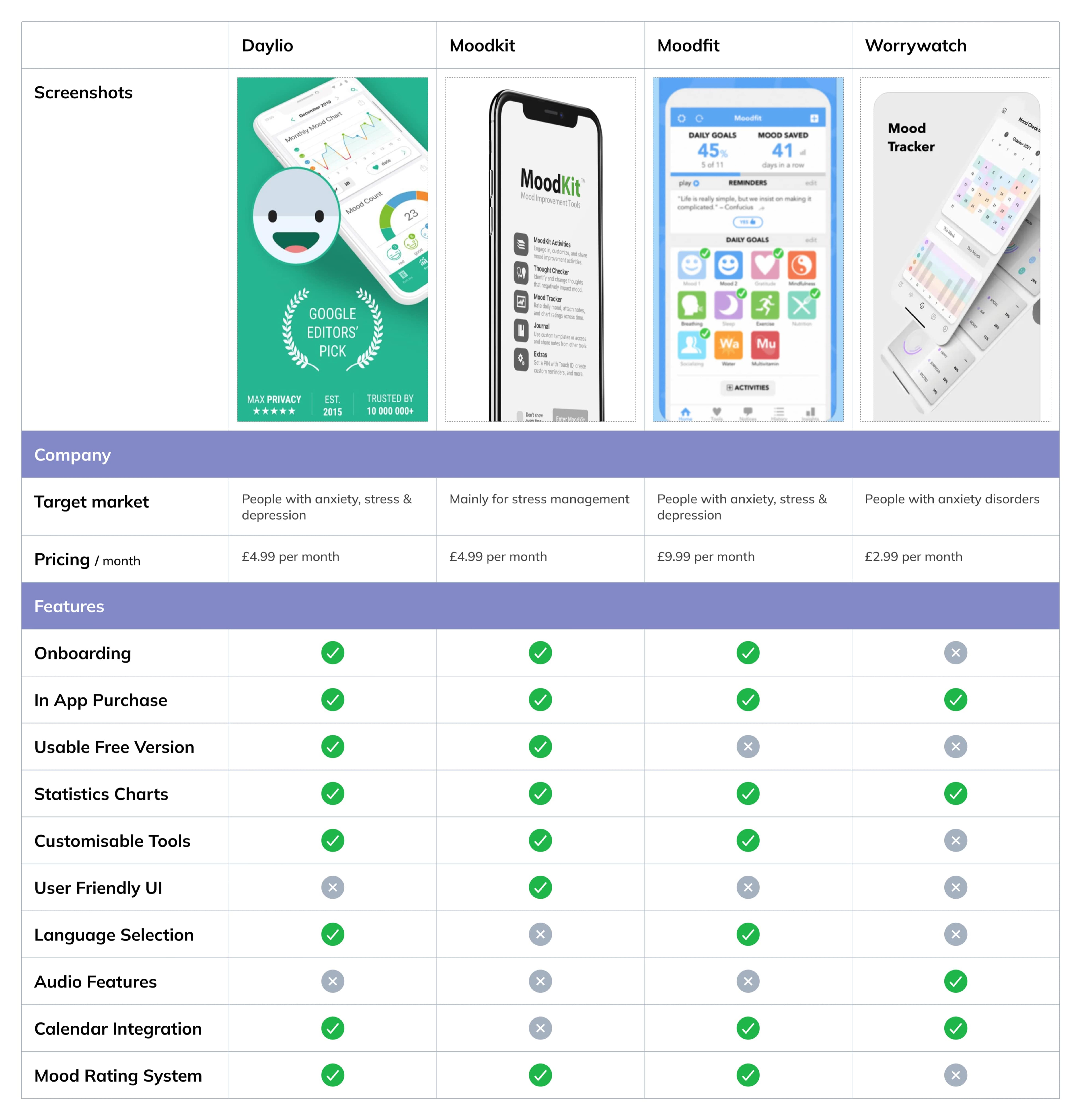
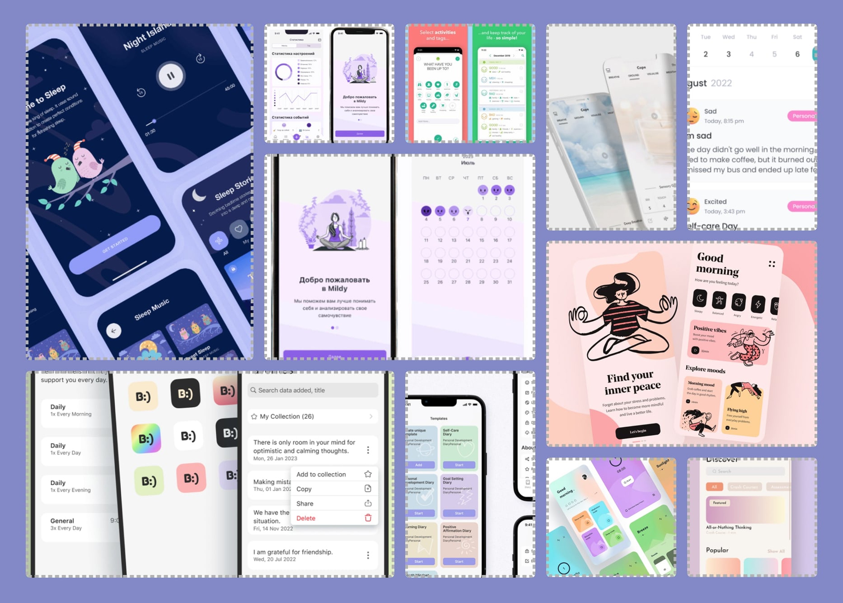
Competitive Analysis
In order to understand key objectives, marketing profile, strategy and usability of similar products, I went searching for some.
The applications that I found (see below) are the most successful current mood tracking apps on the market. I analysed the different features, reviews and specs of each and came up with a list of pros and cons.

Research Goal
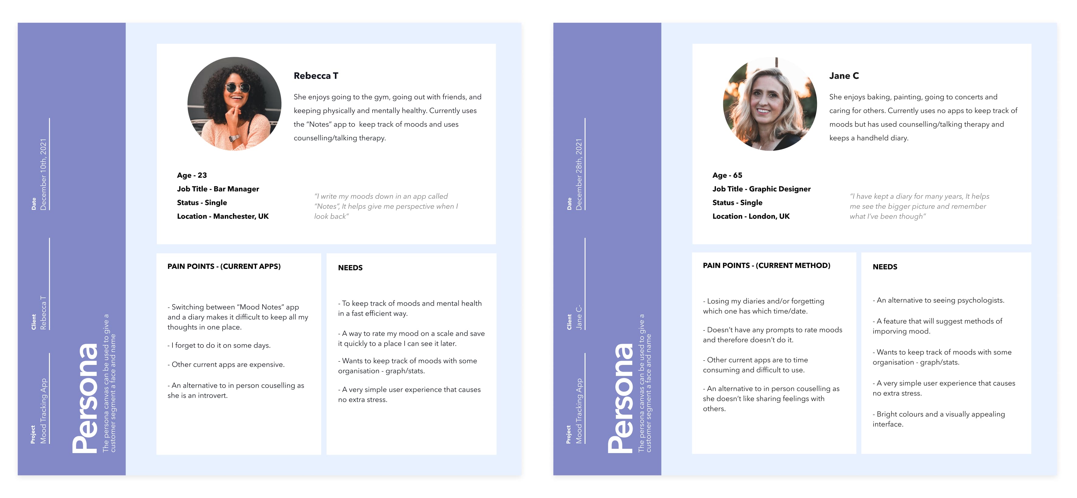
I was interested in exploring opportunities in mood tracking wellness products. I interviewed 3 people who had used mood tracking digital products, and surveyed a total of 63 adults. The purpose was to find clear evidence backing what users look for in mood tracking apps, pain points, and what current apps may be missing. The results would contribute to some of the final products key features.
[ User Personas ]
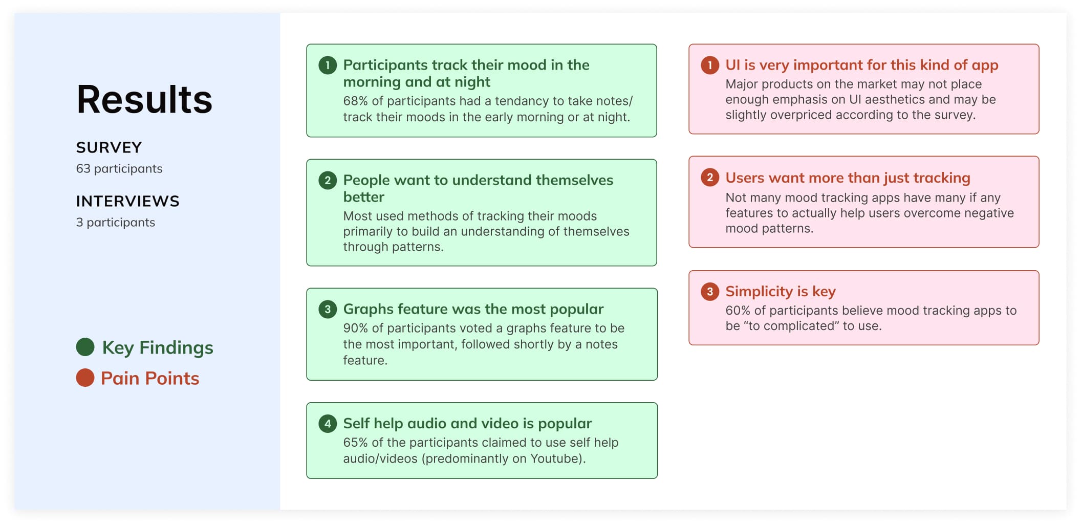
Research Synthesis: Themes & Opportunities
To narrow down feature ideas, I created an affinity board from interviews and surveys. A key insight was that 65% of users turn to Spotify and YouTube for self-help, revealing a market gap for mood tracking apps offering integrated audio and video support. Current competitors either lack these features or limit them to premium tiers.

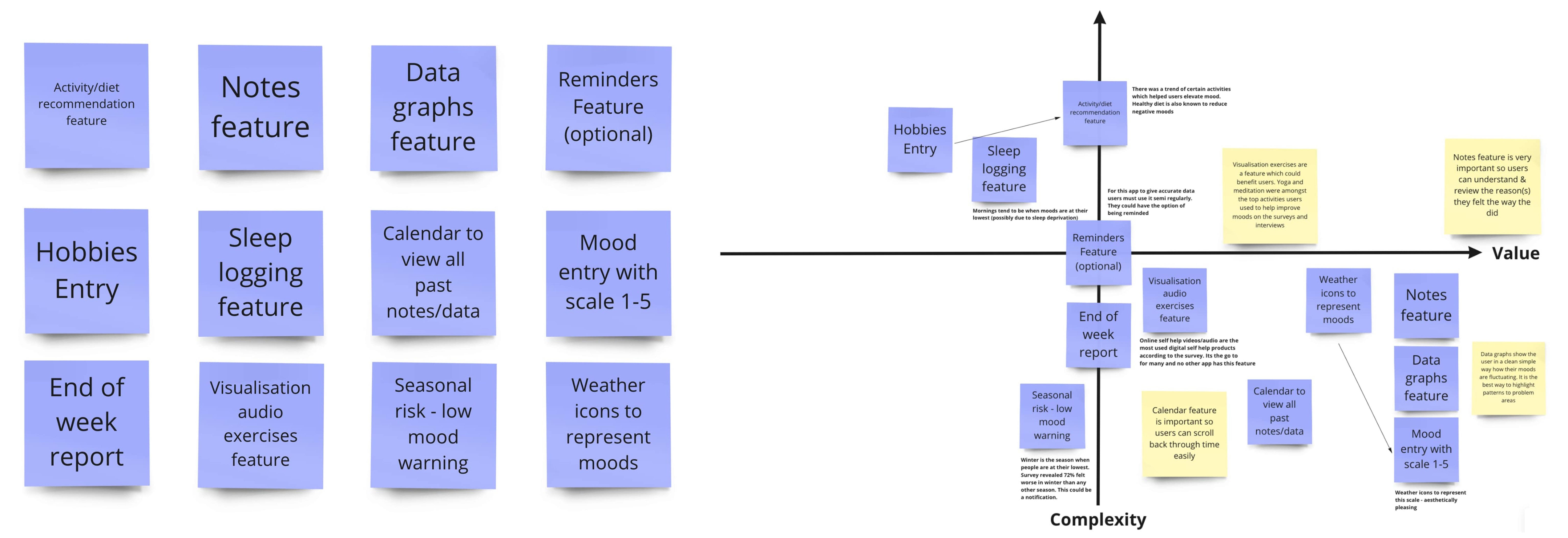
After going through all the data, I produced 12 top features for potential solutions and prioritised them according to risk & value.
Early Proposal
I proposed a design with easy accessibility to all important features & pages (Home, Zen, + button, Calendar, Settings).
Design: emotionally effective (colours, icons).
Navigation: Easily understandable transitions.
Personalisation options on home screen (DP, customisable settings).
Self help audio (Zen): for different purposes (sleep, anxiety, stress)
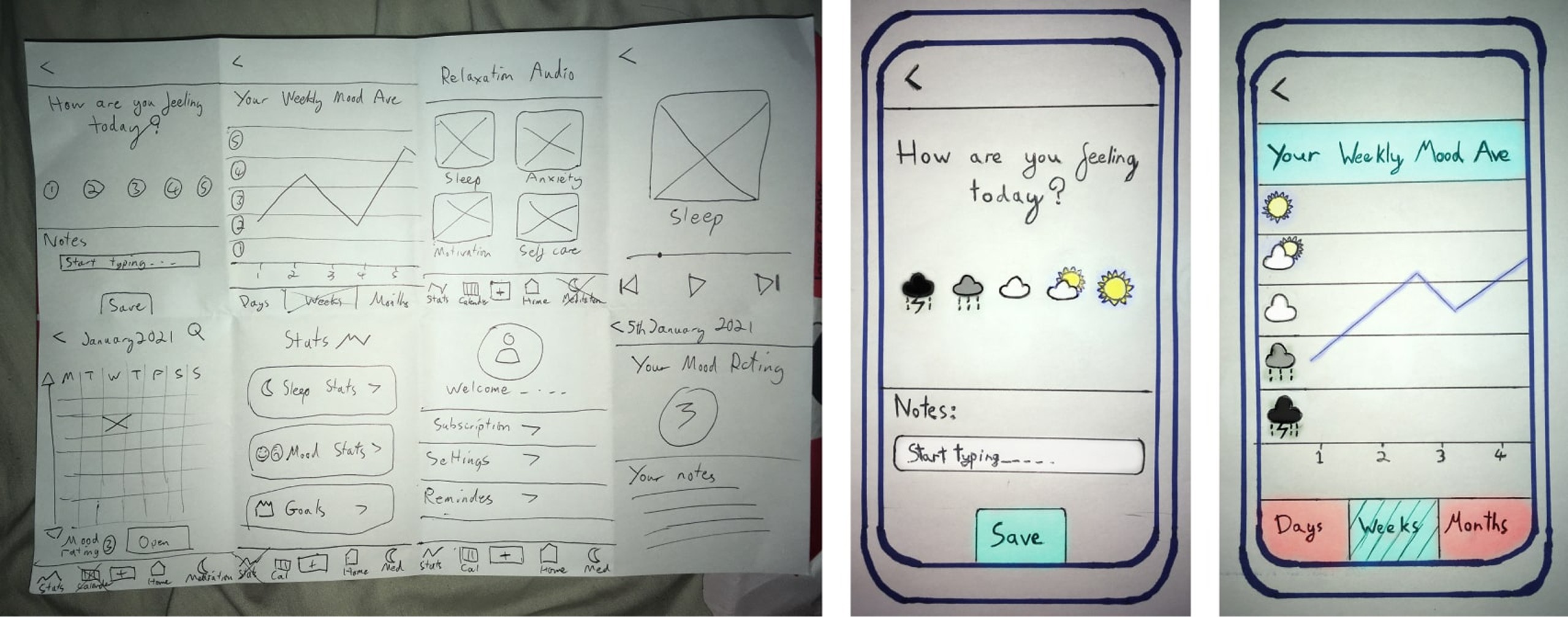

A low-fidelity prototype was used to validate key user flows and scenarios, with user feedback collected via Lookback and Zoom to guide design decisions. Below are a few of the key screens:
Key Issues
20% of users had confusion between Login & Sign Up buttons due to arrangement & hierarchy.
50% didn't understand what to do once signed in.
All users thought calendar page was unclear and didnt understand it's purpose due to layout.
10% of users thought the enter mood + button was not clear enough - no CTA instructions.
The main issue was confusion with the flow. Moving forward with the high fidelity iterations, I would go on to solve these issues with colour coding, CTA buttons/instructions, modals, extra screens and layout.
Inspiration
The colors were inspired by wellness apps and chosen for their calming effect, with 73% of survey participants favoring light blue and green. Commonly used in hospitals and therapy settings, these hues became the main UI palette and were tested with WebAIM to ensure accessibility for users with color blindness.

Laying Down The Foundation
I decided that this product should have a clear, wholesome feel: (calming colours, icons, simple flow). It was very important that a wellness app like this wouldn't create any unnecessary frustration to the user, who could possibly already experiencing a mental health issue.
The theme to represent moods would be weather icons instead of faces or numbers. The idea originated from a Steven Fry quote: “mood is like your own personal weather”.
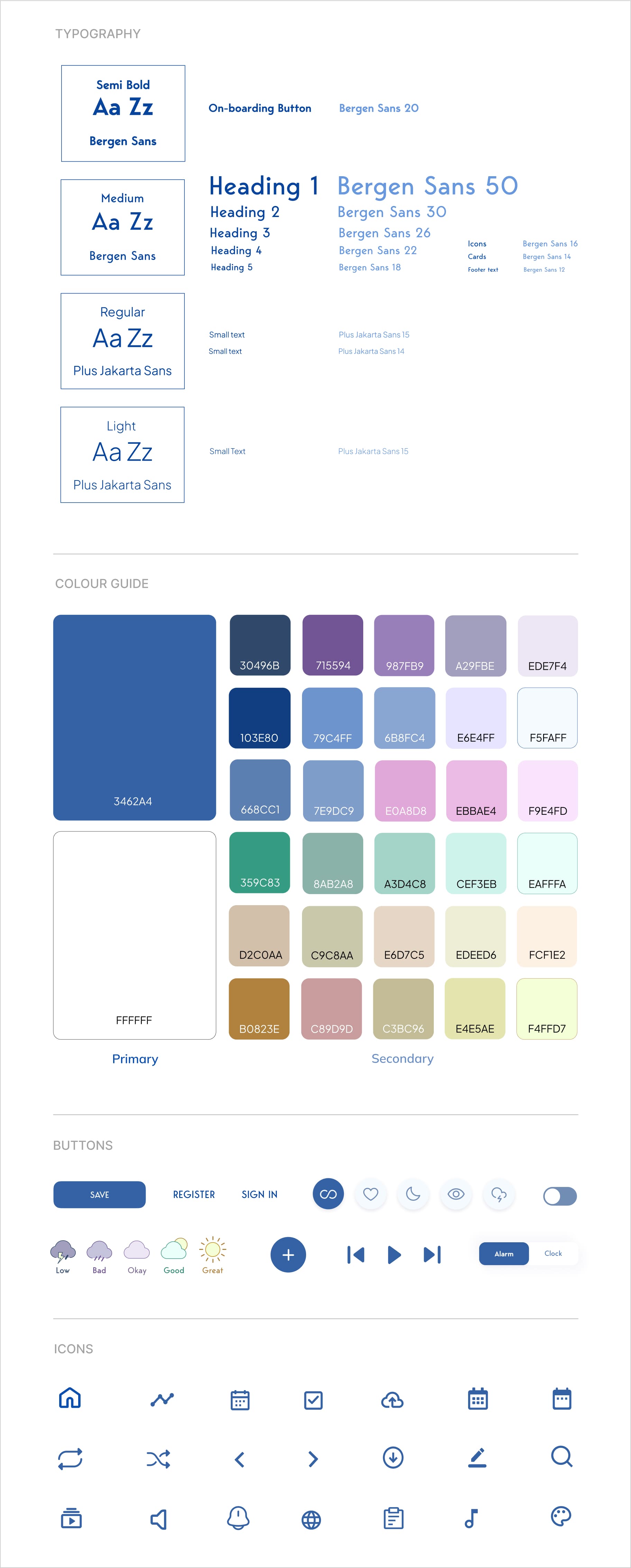
Style Guide
This is a style guide for Mood Rec mobile application. This style guide contains colors, typography, buttons, and icons:
After designing the first high fidelity prototype, I performed a usability test on “Lookback”, to test how the designs performed.
Key Finding:
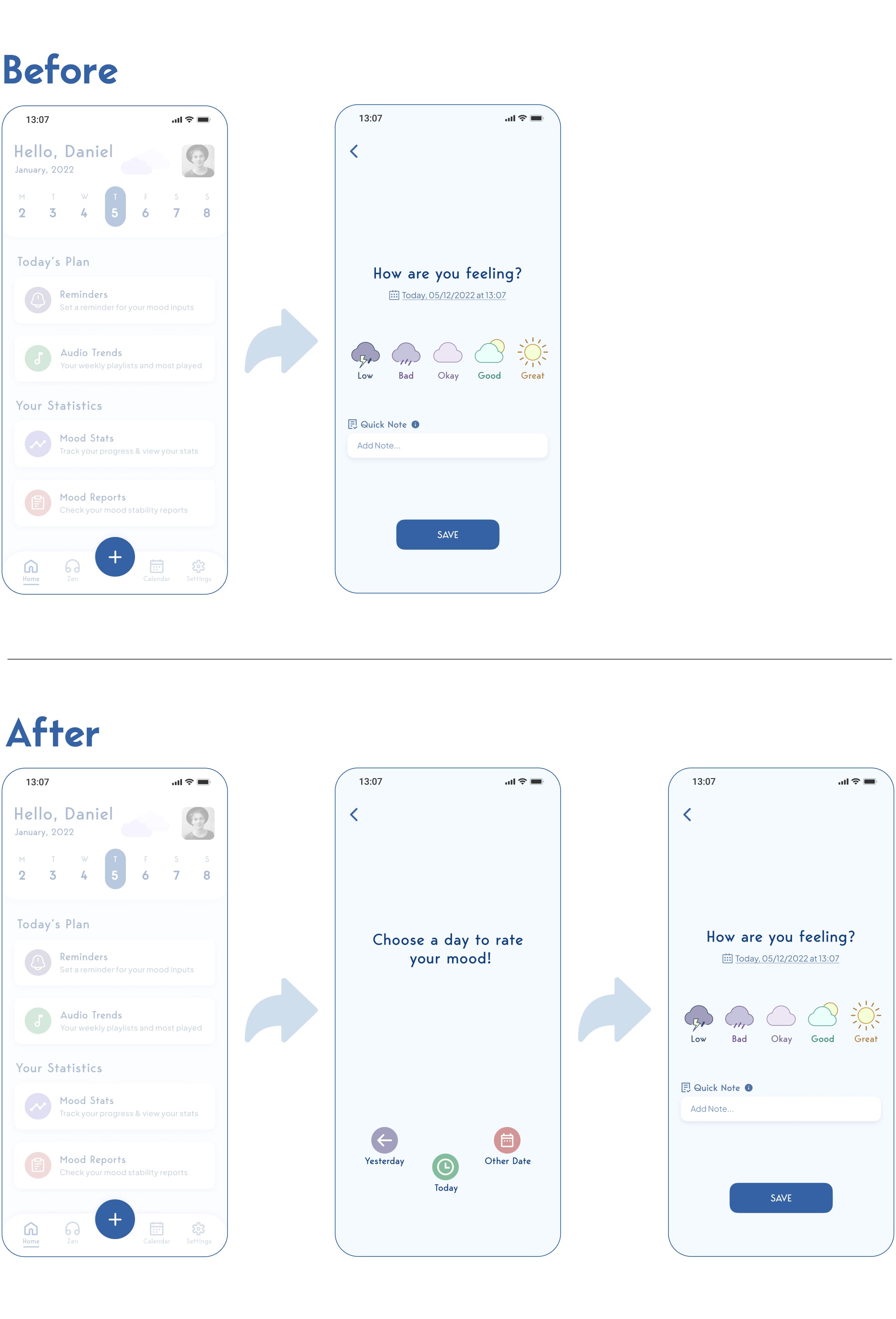
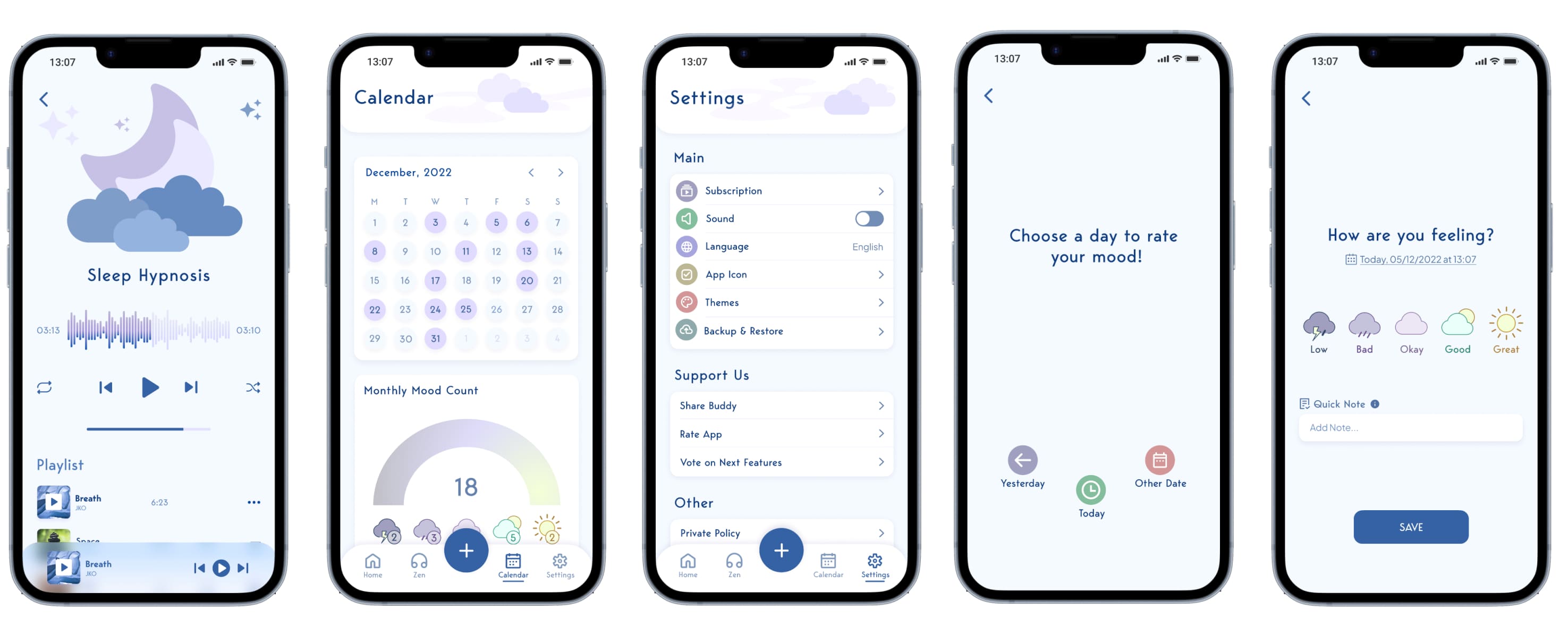
During testing it became clear that users didn’t realise they could change the date of their mood entry. Although the rating page included a small date selector, it wasn’t noticeable enough, and most people assumed they could only log a mood for the current day.
To address this, I added a modal that appears when users tap the Add button. It presents three clear options: Today (the primary, central choice), Yesterday, and Other Date. By bringing these options to the surface with simple, recognisable icons, users immediately understand that they can backfill missed days or choose a different date before rating.
Although this adds an extra step, it proved far more intuitive and quicker to use. Testers consistently found it clearer and easier to understand at a glance than the original hidden date selector.
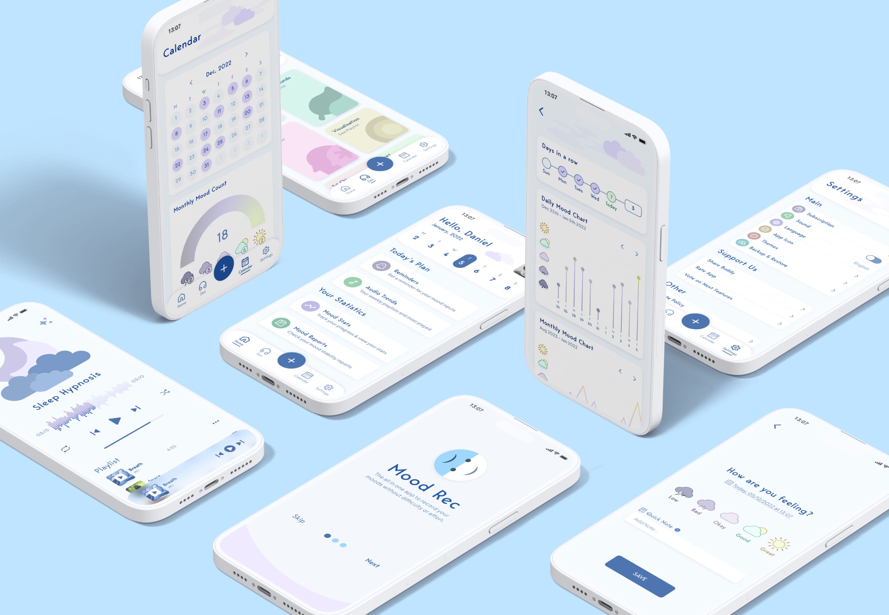
Animations & Micro-interactions
During high-fidelity testing, users were losing interest quickly. I added animations and micro-interactions, like an animated navbar underline and moving clouds to create a more engaging, responsive experience. These cues also improved accessibility for users with color vision or mild sight issues, and overall user attention and engagement increased significantly.
[ Navbar & Page Animations ]
[ Mood Tracker Selection ]
[ Calendar/Zen Page ]
Final Iterations
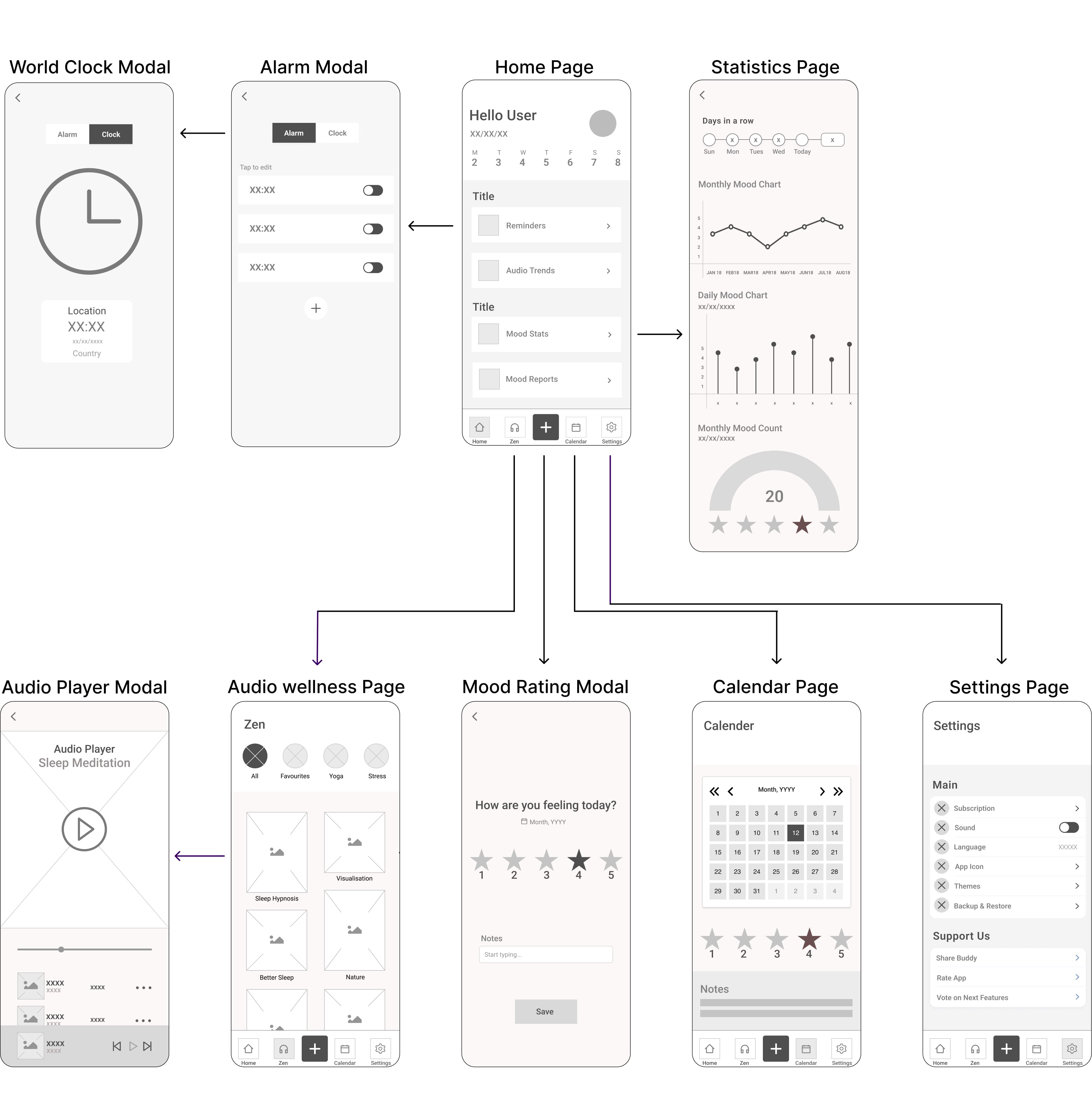
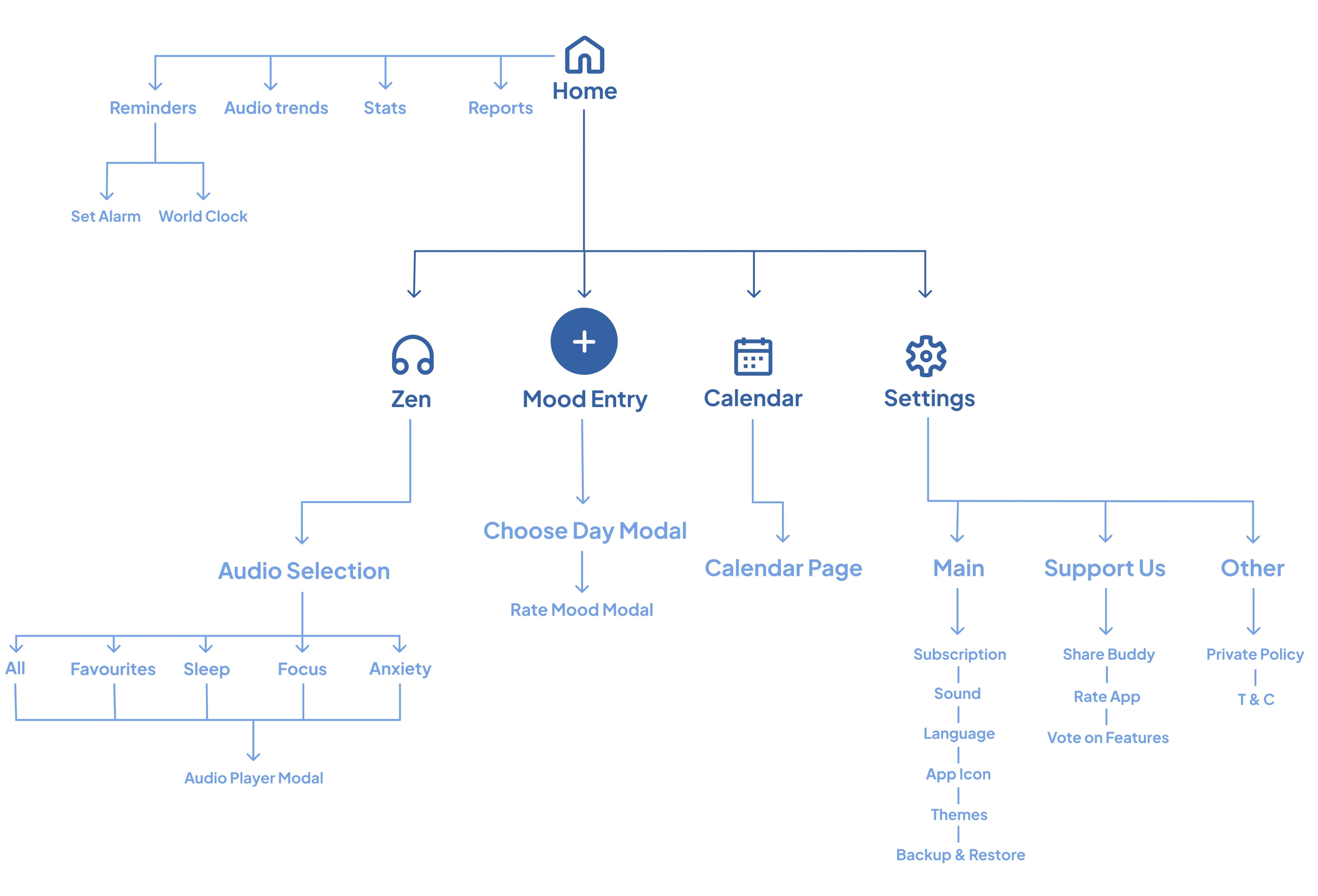
Before iterating on the final design, I first re-worked the user flow & polished the products features.
Below are some flowcharts, which detail some of the key user flows throughout the app, as well as all the potential features. When moving into the development phase of this app, flow charts like this will lower the workloads for engineers/developers & highlight any problems that may be present.
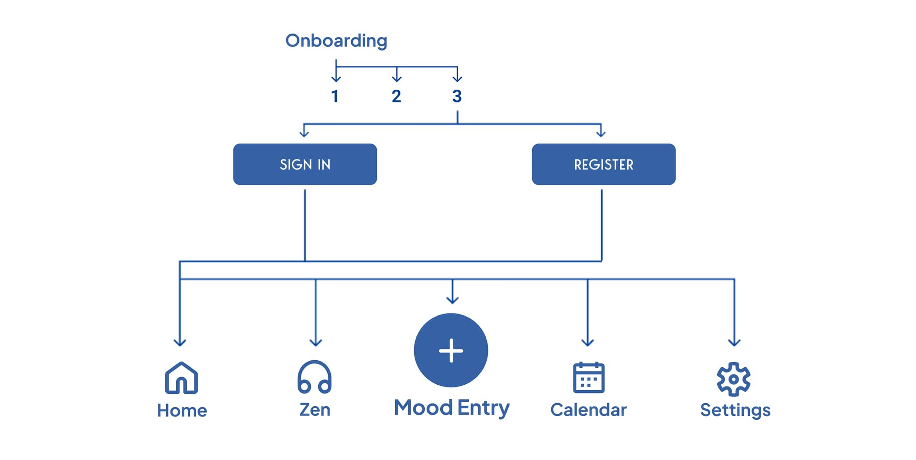
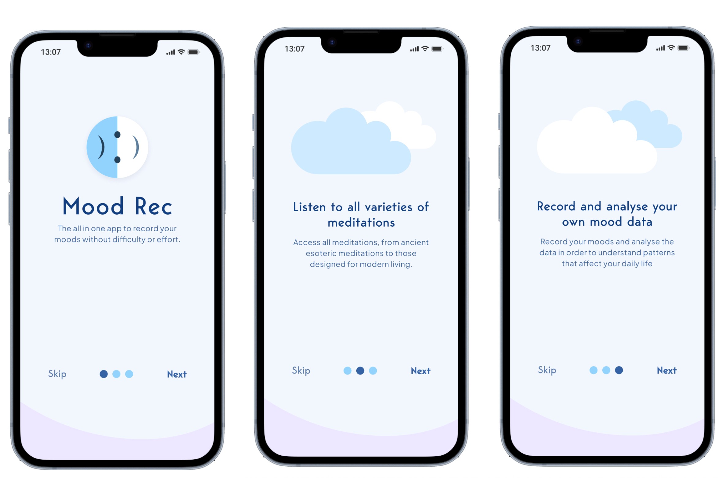
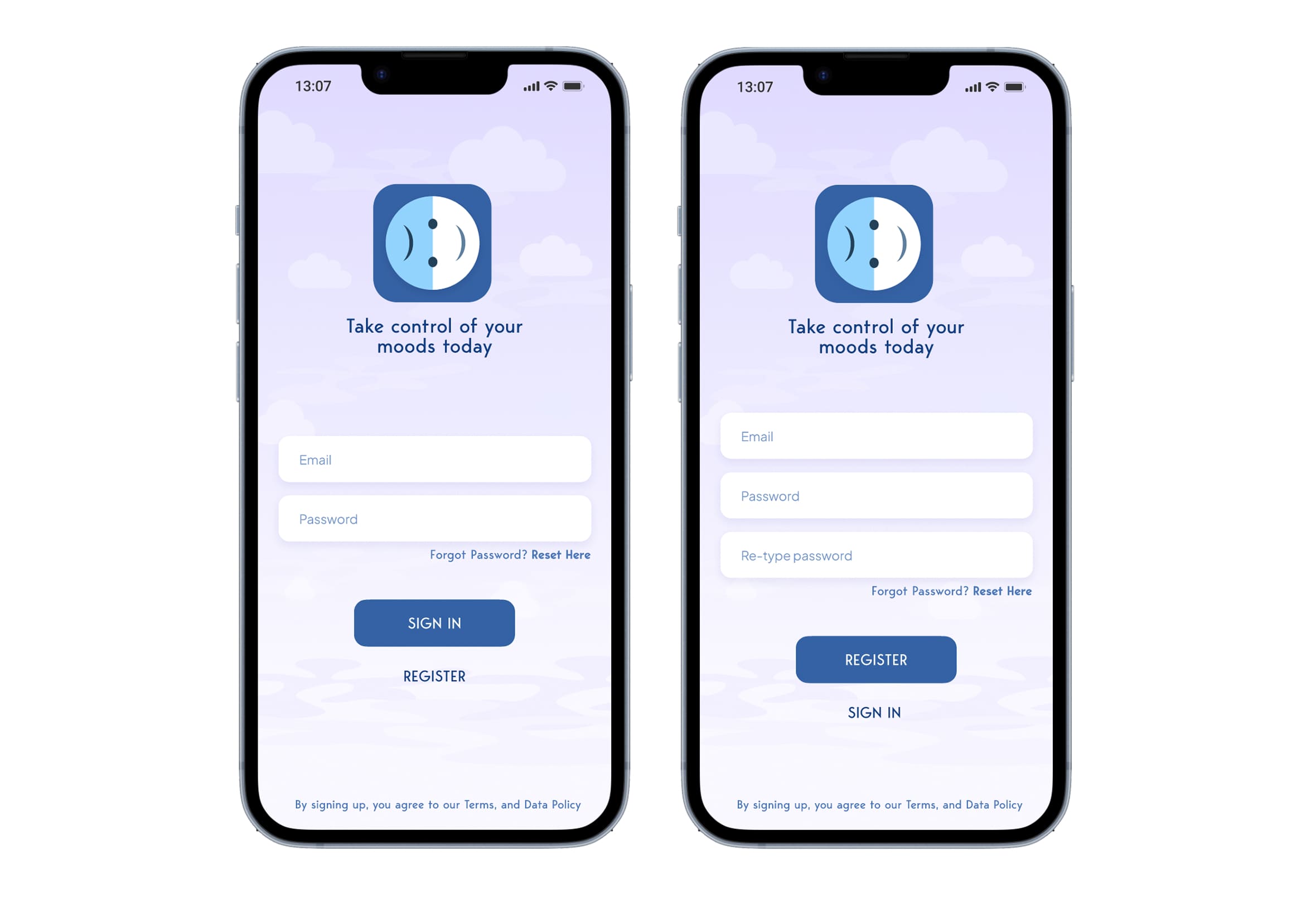
Onboarding
Upon opening the app, users will be guided through a process that explains the purpose of the app as well as some of the features. They are then guided through the “Sign In” &/or “Sign Up” page(s) before progressing to the main default “Home” page. This page contains a footer navbar with five other tab options (including the home screen):
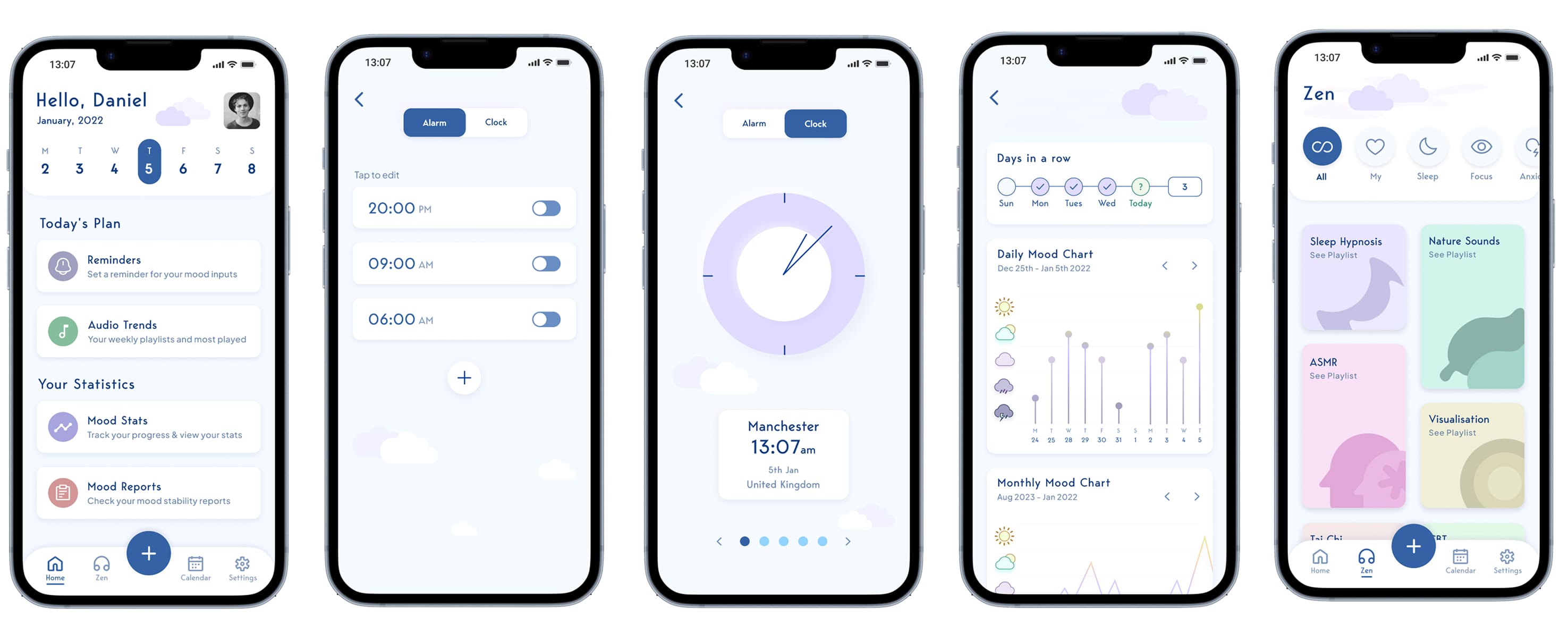
Features & UI elements
I have arranged some of the main feature screens for viewing, as well as the final prototype. One of the features I have primarily focused on improving the user experience for the "Zen" (audio section) of the app. Some of the data from the research indicated that most people turned to Spotify and Youtube when they are feeling down for calming music/meditation audio. This is also a feature that makes this product unique as there are no other mood tracking wellness apps that provide this. Here is a brief description of the 5 main navbar features:
Home: Main default dashboard where users can reminders and check out their personal statistics/audio trends.
Settings: Users can use the settings page to personalise their experience and manage their subscription.
+ Button: Users tap this button to rate their moods/write notes in a fast & efficient manor.
Calendar: Users can view, delete &/or edit previous notes/mood ratings.
Zen: Users can listen/download self help audio for different purposes I.E. meditation, a very unique feature.
Impact
Post-Testing Impact Metrics:
Awareness of date options: 100% of users understood they could log moods for Today, Yesterday, or Other Dates (up from 40%).
Task efficiency: Mood entries were completed 30% faster on average.
Engagement: Time spent per session increased 25%; users found interactions and animations more responsive and enjoyable.
Accessibility: Users with mild vision differences or color blindness navigated the navbar and key screens successfully, thanks to motion cues and clear hierarchy.
Zen feature adoption: 70% of users explored the Zen audio section (up from 20%).
What I have learned from this project?
I really enjoyed designing this app, and thanks to insights from user interviews, surveys, and testing, I consider the project a success. The research uncovered unexpected findings that shaped and strengthened the final product.
As an artist and musician, I am drawn to aesthetics, but this project reminded me that UX is ultimately about understanding users, their problems, and solving them through design. Looking back, there is room for further iterations, especially in the calendar and notes section, where editing entries and selecting exact dates could be made clearer.
View Prototype →
View Prototype