[ Scroll ↓ ]
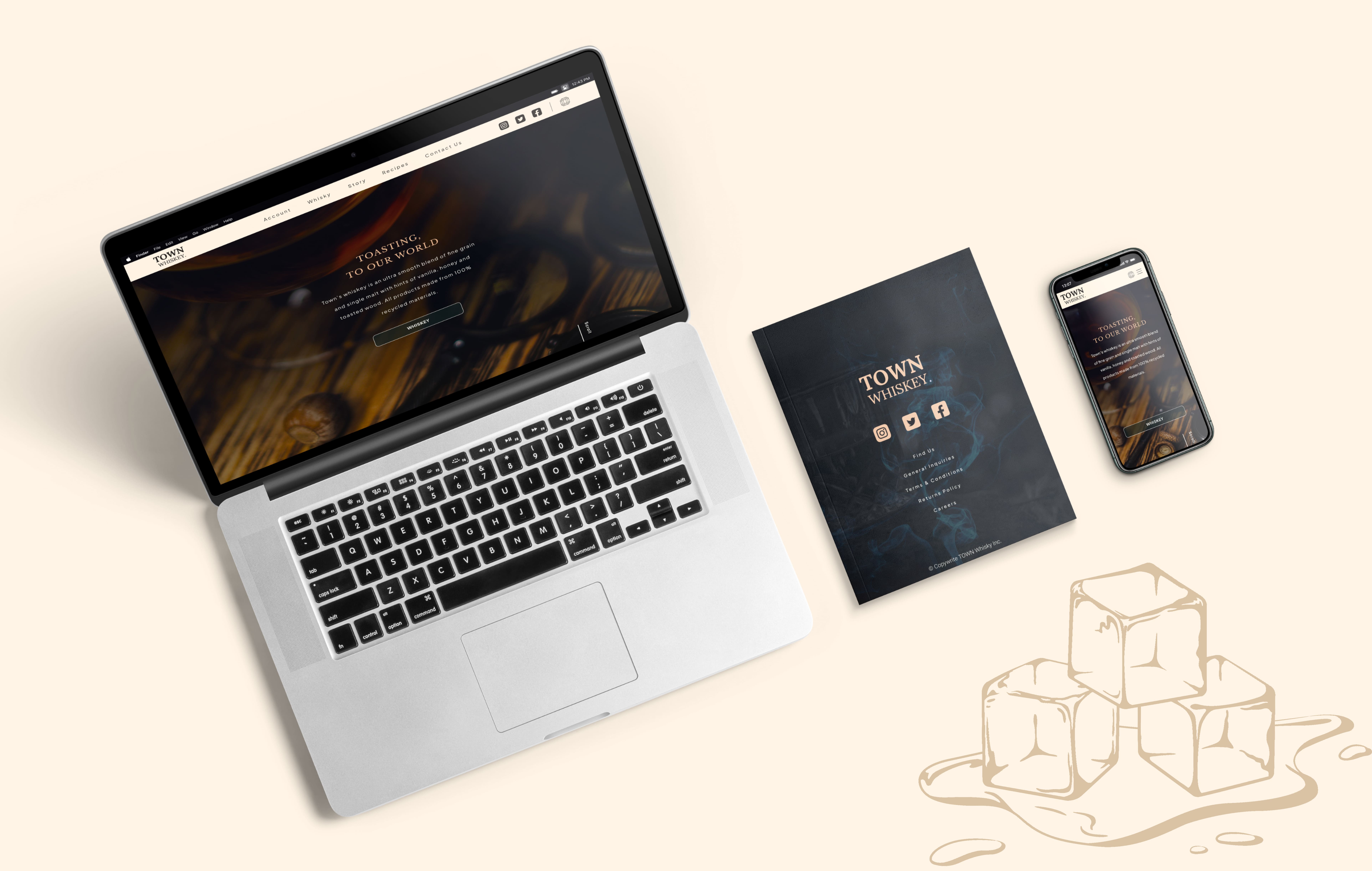
Town Whisky - Eco Spirits
Project Duration
11/12/2022 - 07/03/2023
My Role
Product Designer
Share
Project Overview
Town Whisky is a new brand from Robin Hoods Bay, aimed at people seeking high-quality whiskey at a reasonable price, while also supporting eco-friendly solutions to climate change. In the wake of the pandemic, Brexit, and the war in Ukraine, economic uncertainty and rising costs have made consumers more conscious of both price and sustainability. I was tasked with researching opportunities in this space and designing the platform, collaborating with the client who led the branding and whiskey development.
The Problem
Many food and beverage companies still use limited recycled materials, while demand for eco-friendly products is rising. Consumers are struggling to balance enjoying products they like with choosing ones that support sustainable practices.
High Level Impact
Post-testing improvements reduced friction and increased engagement across the experience, leading to a ~30% increase in checkout completion and stronger alignment with Town Whisky’s premium, eco-conscious brand.

The Goal
The goal was to understand the problem and explore whether eco-friendly products could inspire sustainable behavior, offering a premium whiskey experience for users committed to reducing their carbon footprint.
Process
My process is adapting and evolving with every project. It will be determined by the goals of the project, the problem/problems that need to be solved, time and resources.
The process I used to solve this problem was as follows:
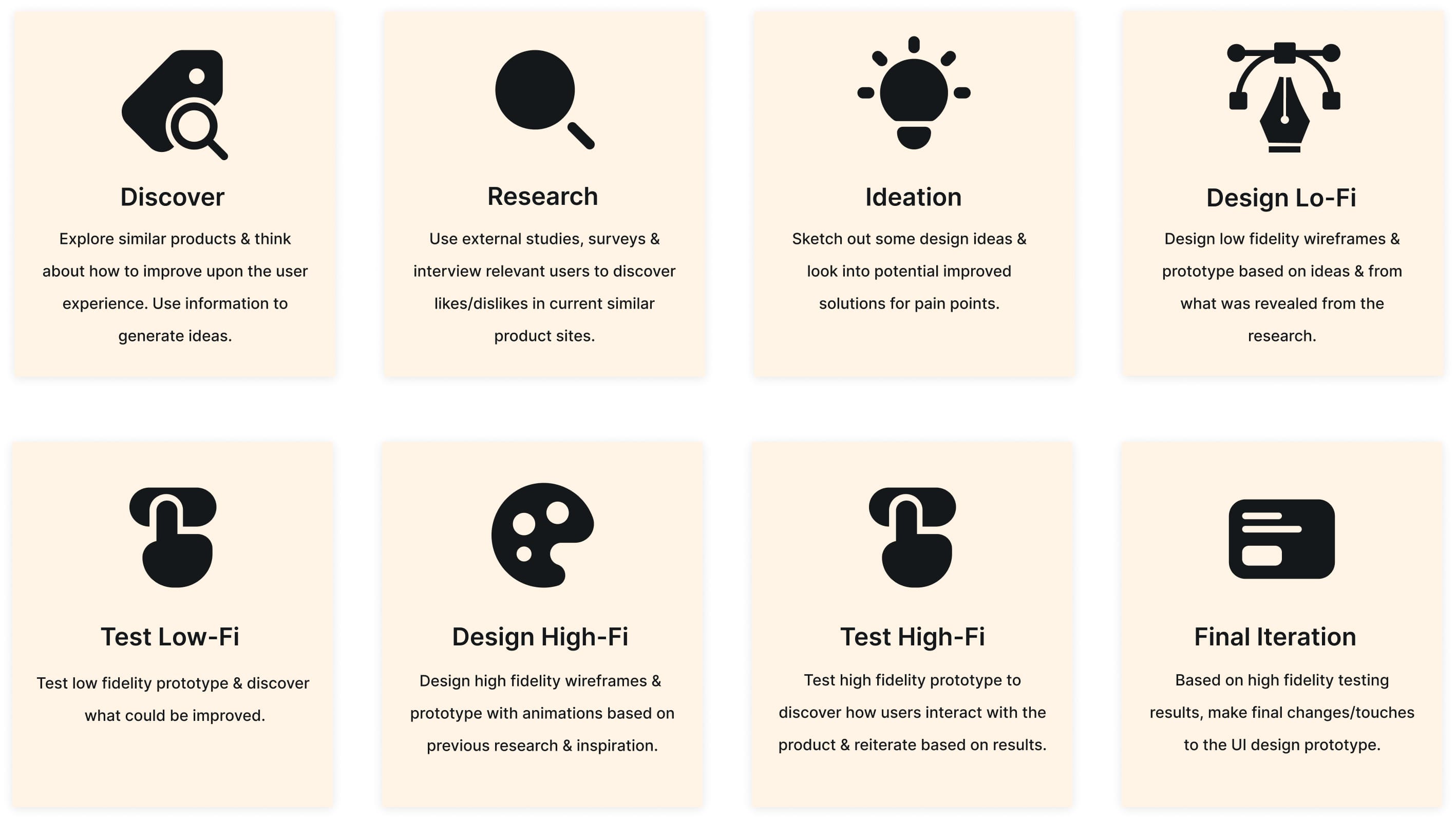

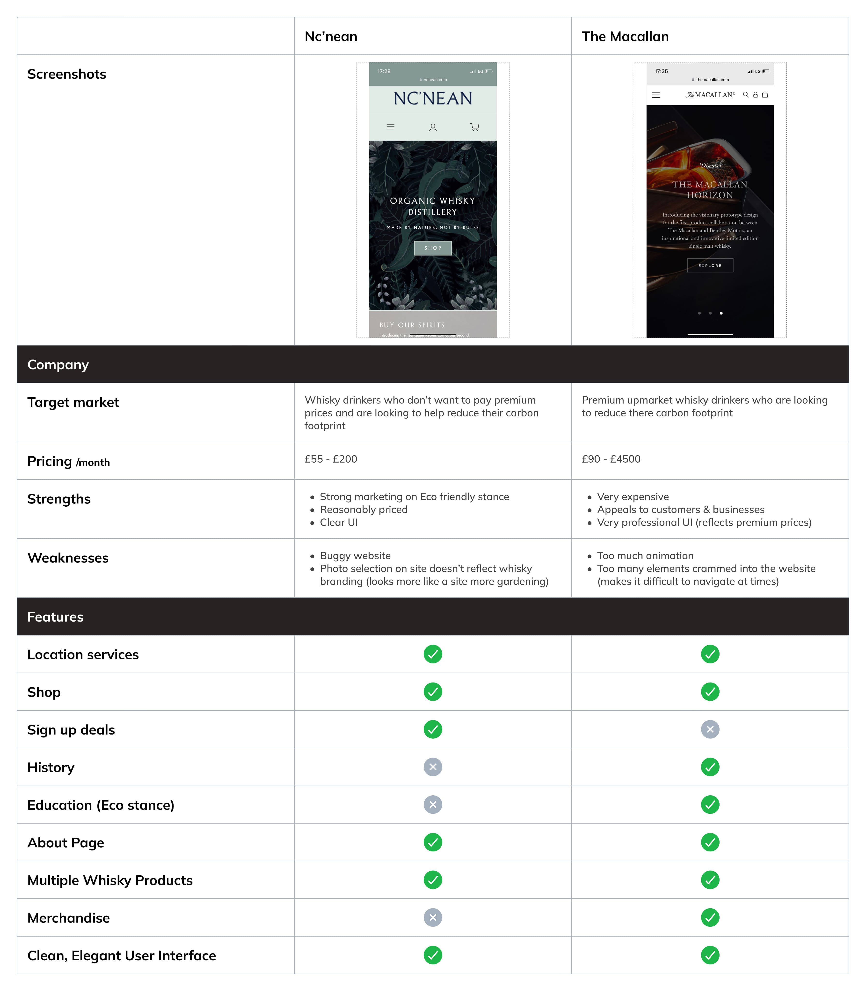
Competitive Analysis
In order to understand key objectives, marketing profile, strategy and usability of similar products, I went searching for some.
I could only find a handful of whiskey brands using 100% recycled materials as well as using renewable energy. Two of these brands were Nc’nean and The Macmallan. Both distilleries for these brands run off 100% renewable energy with the vast majority generated by on-site biomass boilers. In 2019, just 0.01% of Nc’nean’s waste went to landfill.

Research Goal
The research focused on identifying market opportunities for this product by exploring sustainability efforts in the beverage industry and how different demographics perceive climate change. I reviewed existing studies, then conducted interviews with 3 participants and a survey of 77 adults. These insights directly informed the product’s key features and themes.
External Studies
I reviewed existing studies on sustainability in the food and beverage industry and cross-checked key findings with my own survey and interview data. A recent study from the Journal for Waste Resources and Residues highlighted that:
Beverage companies use an average of just 7% recycled materials
Large brands account for 93% of aquatic plastic and glass bottle pollution
Glass bottles have over 4× the environmental impact of plastic due to higher energy and resource demands
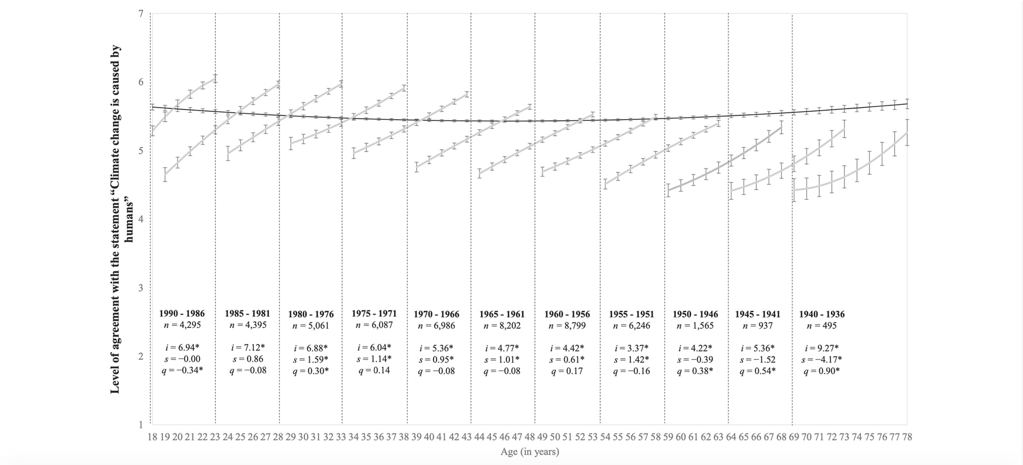
Age Demographic & climate change
Regarding climate change and the age demographic that appears to be most concerned about it, I found a large study conducted by the University of Auckland Human Participants Ethics Committee and the Pew Research Centre.
Here is a data graph taken from over 27,000 citizens across the 28 European Union countries. It shows that those aged 15–24 years old are more likely to be concerned about climate change than those aged 55 and over. This data is however a few years old (2017):
Who Drinks Whiskey?
Another question before conducting my own research was: which age demographic actually drinks whiskey? There is an external study by the magazine "Scottish field", which found that 84% of whisky drinkers in Scotland start to enjoy whisky before the age of 31, and 42% after the age of 22.
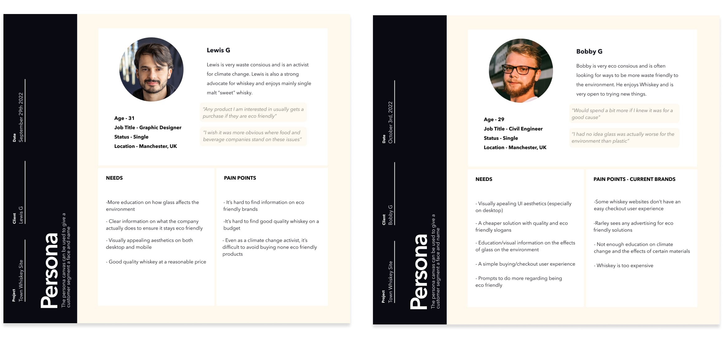
Surveys & Interviews
Following the external studies, I interviewed 3 whiskey drinkers who were between the ages of 26 and 31, and surveyed a total of 77 adults. The purpose was to find clear evidence backing what the external studies had found, pain points, current similar products, feature ideas, and whether there was a gap in the market for this kind of product.
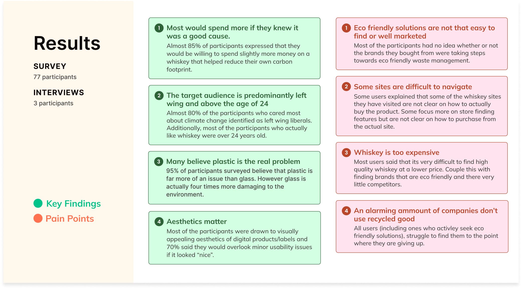

After going through all the data, I produced 12 top features for potential solutions and prioritised them according to risk & value.
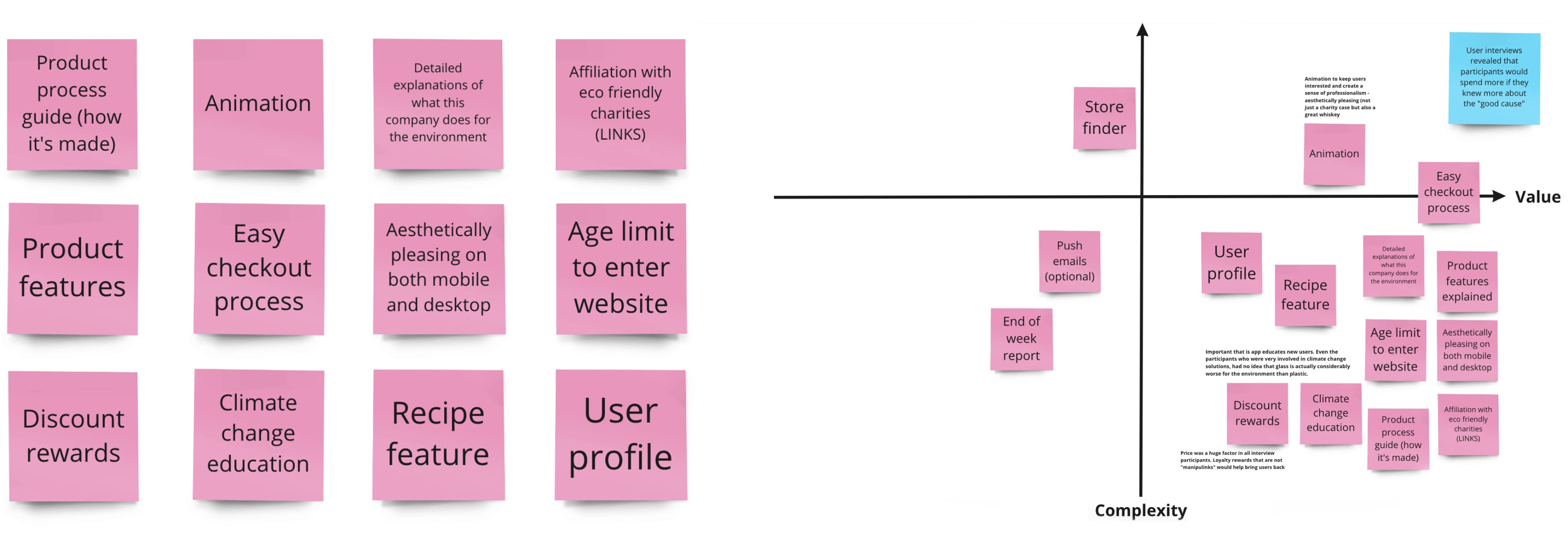
Early Proposal
I proposed a design with easy accessibility to all important features & with a strong sense of heuristic control and easily accessible information on all aspects of the product.
Design: Emotionally effective (colours, icons, brand logo)
Navigation: Easily understandable transitions
Animation: Visually appealing, particularly when user is waiting for something (loading)
Features: Lots of information on steps taken to help the environment and optional CTA for how the user can also help
[ “Crazy 8” Sketches/Ideas ]
Onboarding
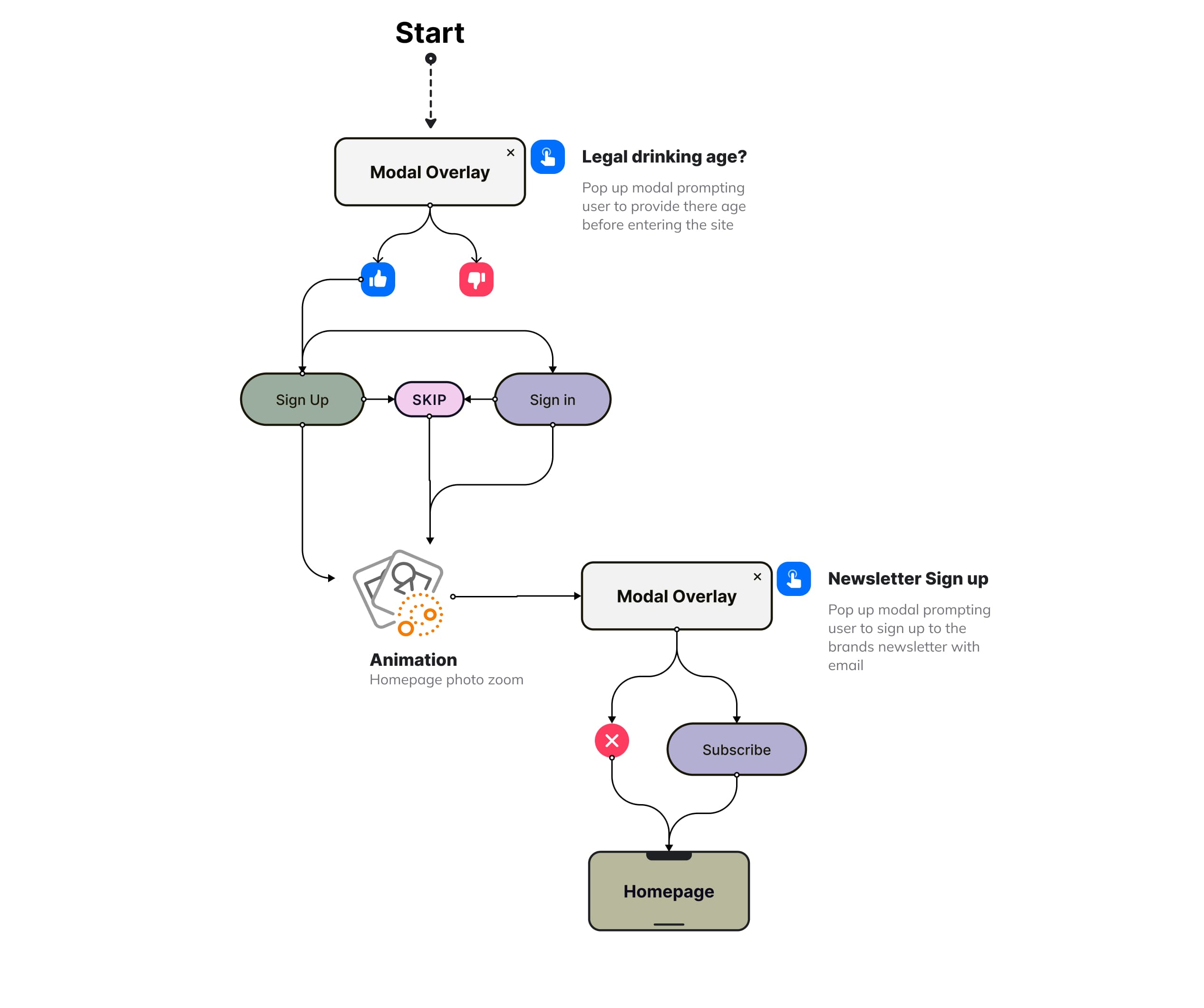
These flowcharts (see below) outline the site’s key user journeys and feature set, helping surface potential issues early and reduce development effort during implementation.
Users are prompted to sign in or sign up on entry before reaching the home page, a client requirement to support early customer list growth. To reduce friction, I introduced a skip option, balancing business goals with a smoother user experience.
[ Flow Chart - Splash ]
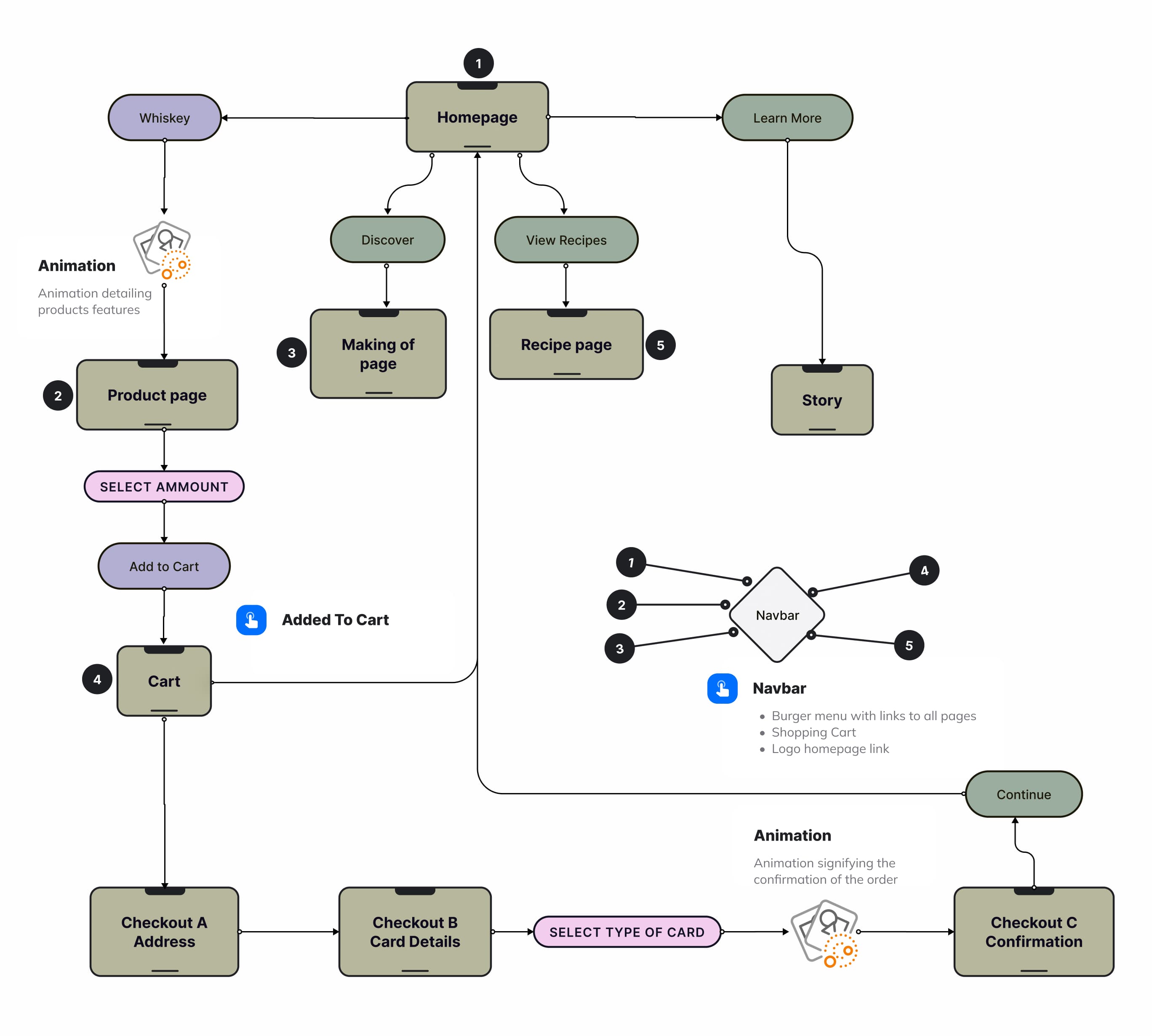
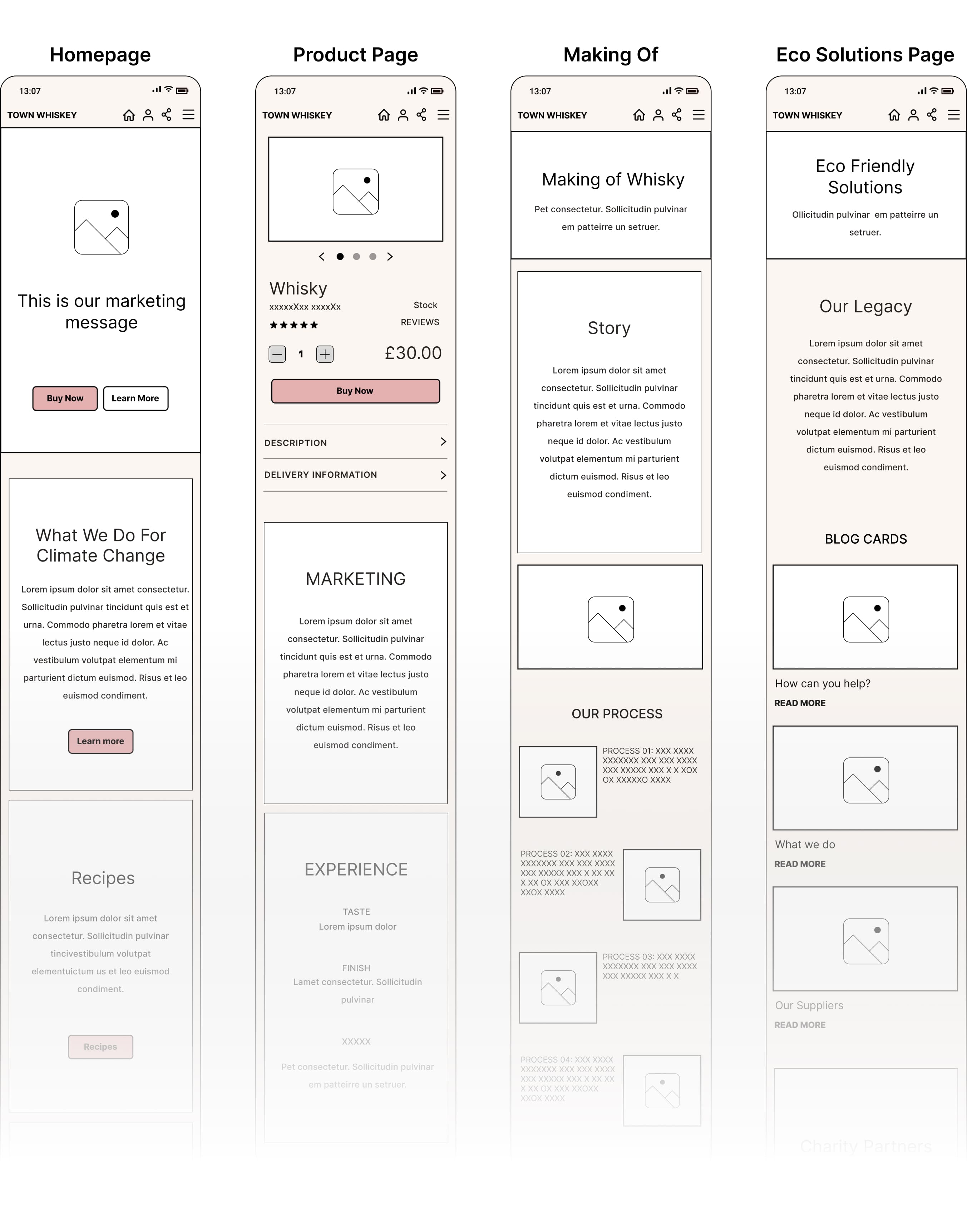
Features & UI Elements
The flow chart below highlights some of the primary user flows that the website will feature.
[ Primary Actions Flow ]

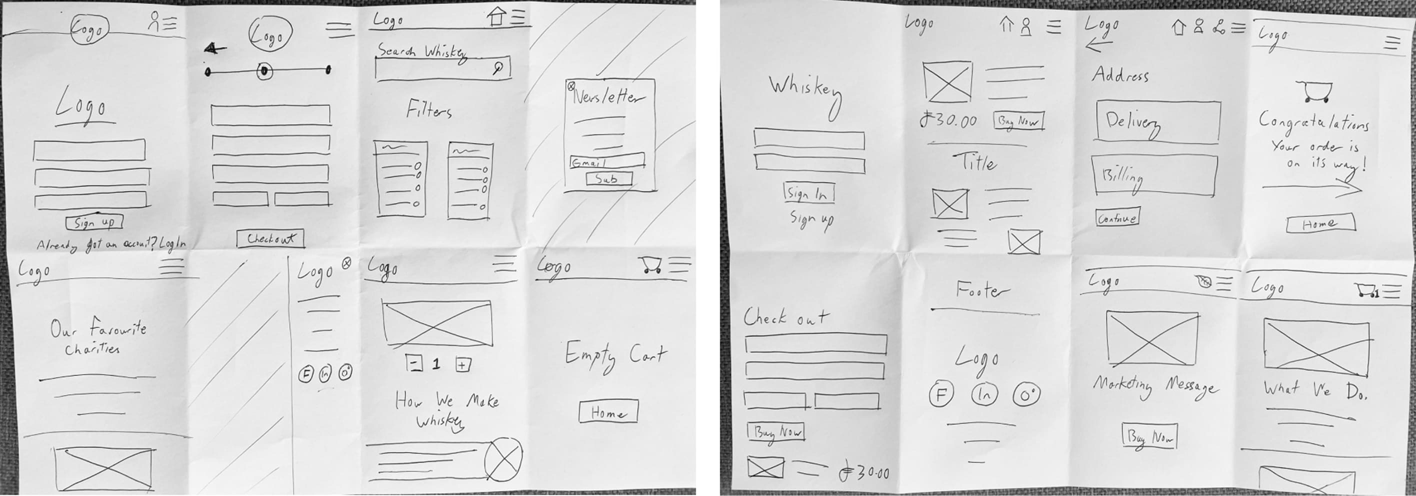
These key low-fidelity wireframes were used to validate the product structure before committing to visual design.
They focused on critical user flows and edge cases, and were tested with users via Lookback and Zoom to identify usability issues and inform iteration.

🚩 Key Issues
1. 50% of users had confusion between Login & Sign Up
2. 90% of users said navbar buttons too small, difficult to press
3. 30% of users thought CTA buttons too small
4. All users had confusion of how to close the nav side bar after opening the burger menu
5. 40% of users thought it was unclear what to do once payment is complete
6. All users were expressed irritation for being required to have an account to enter website
✔️ Solutions
1. Create a clearer hierarchy between buttons
2. Increase icon's frame wrapper size (not actual Icon inside)
3. Create larger buttons with more striking colour hierarchy
4. Create a larger exit button to remove side nav bar. Clicking outside should also remove
5. Create CTA (instructions) after payment
6. Users can skip signing in or creating an account
Inspiration - Following low fidelity testing
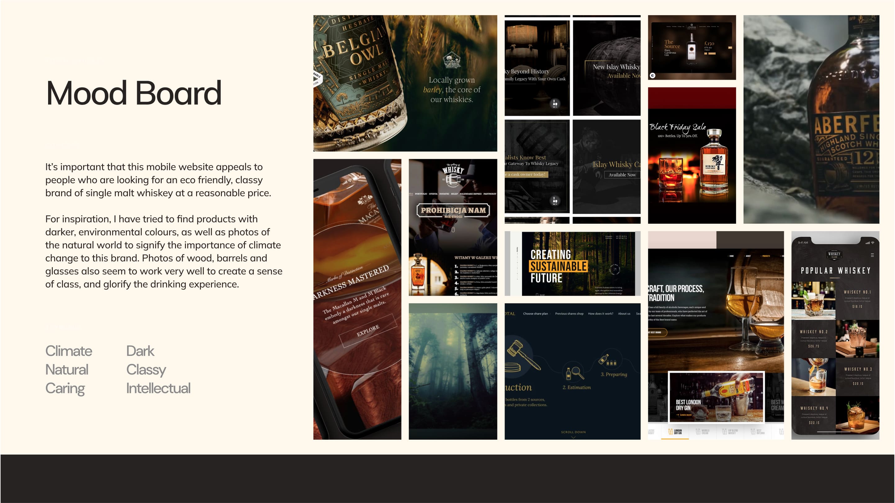
Laying down the foundation
The product was designed with a dark, clear, and wholesome aesthetic, using natural, organic colors to reflect the brand’s eco-friendly stance. All color combinations were checked against WCAG AAA standards using WebAIM.org.
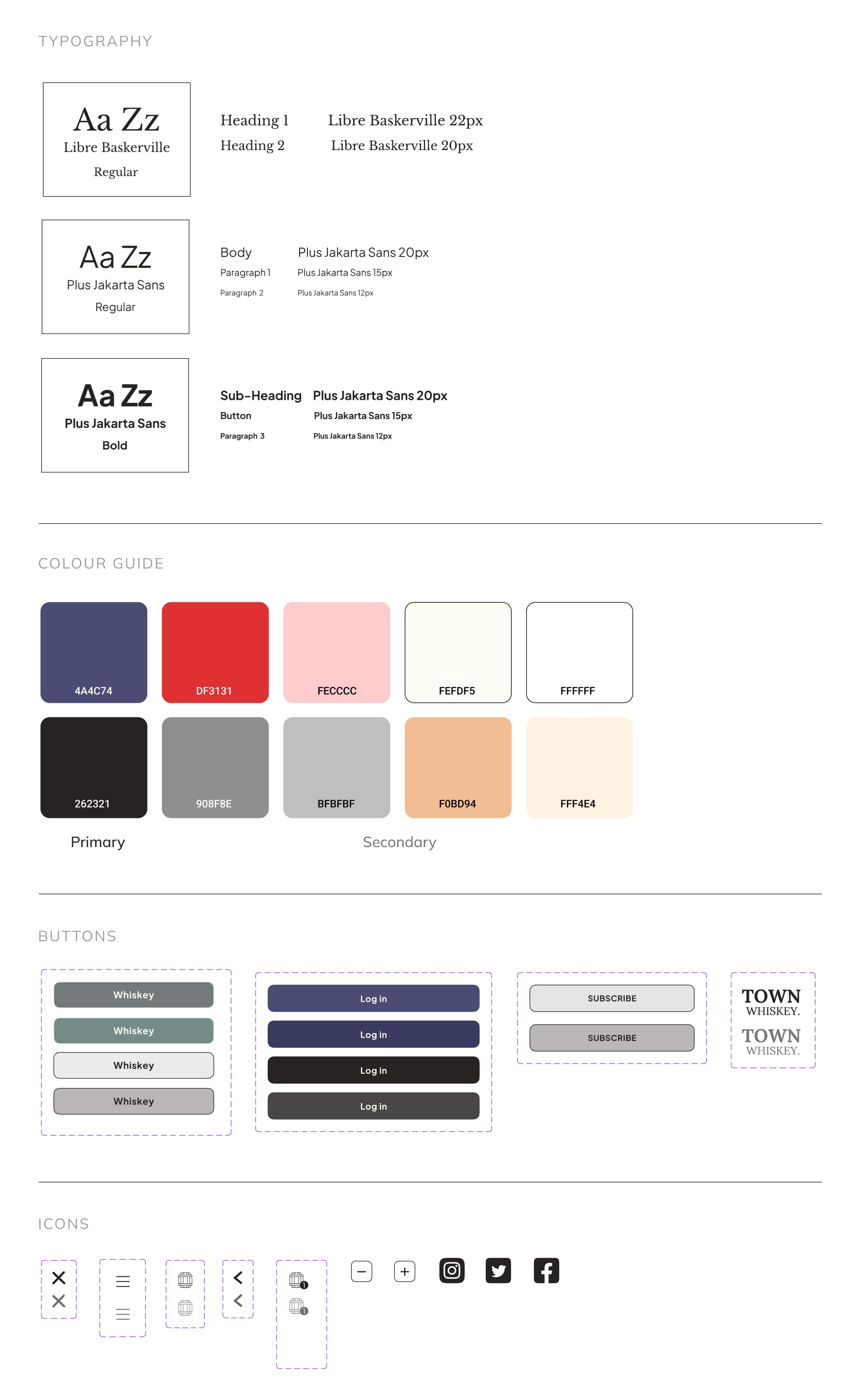
Typography
For typography, traditional serif fonts were used for headlines to evoke aged whiskey, while a modern sans serif was applied to body text, navigation, and buttons for clarity and readability.
Style Guide
A style guide was created for the Town Whisky mobile site, covering colors, typography, buttons, input fields, and icons. After the first high-fidelity prototype, I conducted usability testing on Lookback to evaluate performance.

🚩 Key Findings:
1. Navbar buttons mostly unnecessary as there was burger menu and it didn’t translate well to desktop design.
2. All users thought it wasn't clear where or how many items were in their cart after adding product to basket
3. Half the users pointed out that other payment options other than debit card were required
4. Empty cart page required
5. Nobody actually found the charity page during flow
✔️ Solutions
1. Remove navbar buttons and have only burger menu and shopping cart
2. Highlight cart with colour and add number of ordered Items next to it
3. Multiple payment methods added at checkout stage
4. Designed empty cart page to prompt users to add product to basket
5. Scroll CTA added to main home page to prompt users to explore the site more
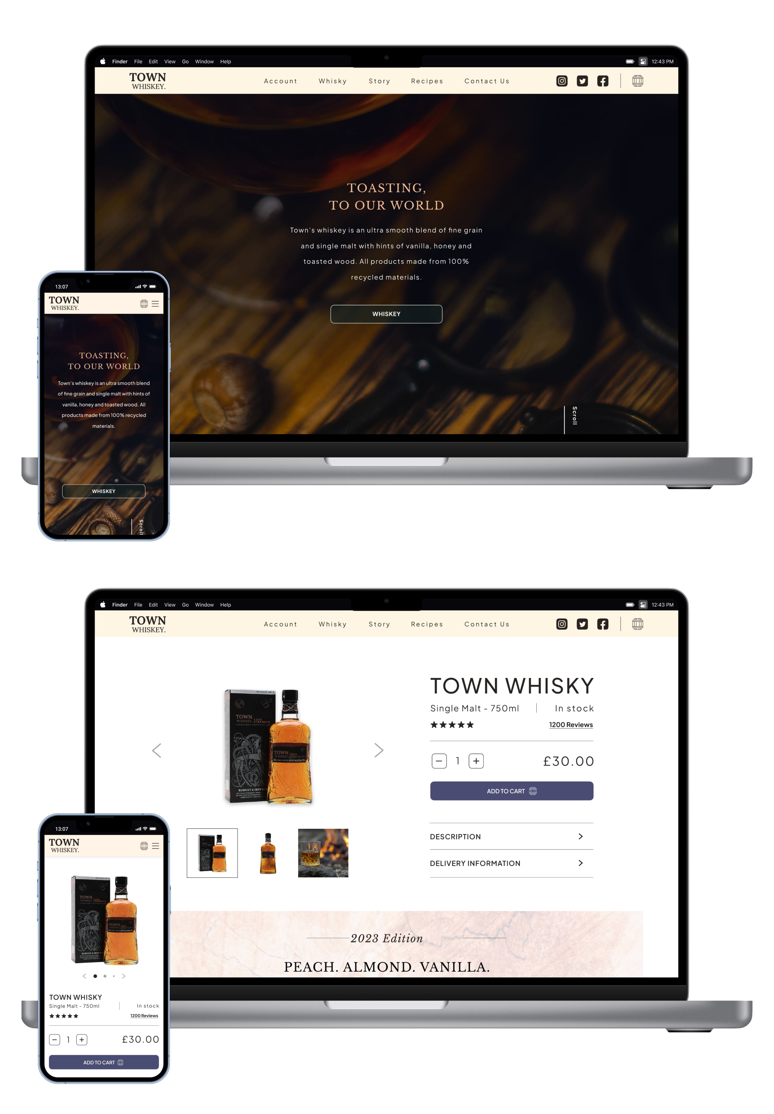
Responsive design
The layouts of some of the pages also required changes as they did not translate well to different devices. In particular the product page and the landing page. The changes will make the developers life much easier. Here's 2 examples of some of the final iterations.
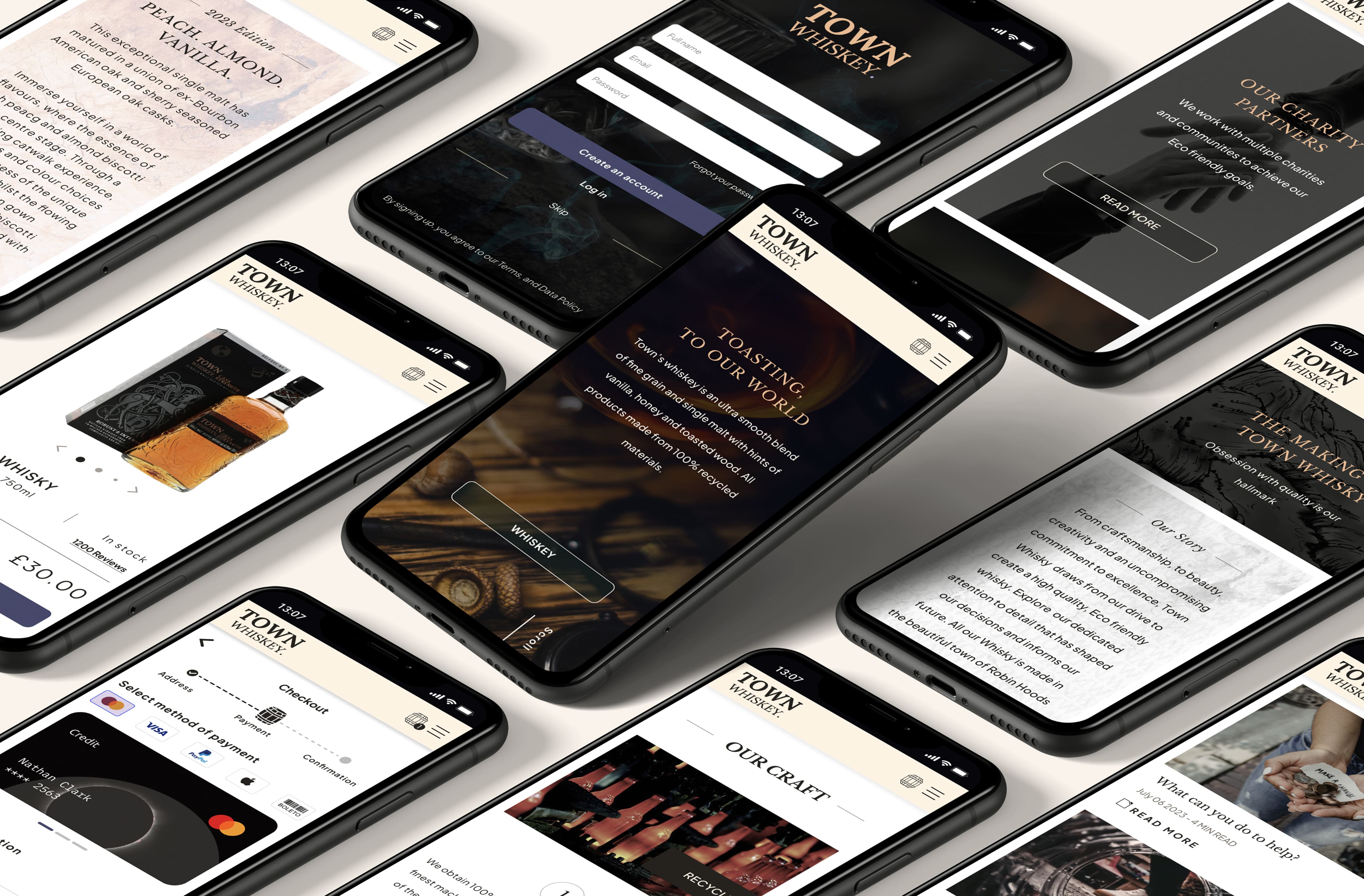
Animations & Micro-interactions
I thought it was important to add some animations and micro-interactions to this prototype in order to keep users attention, particularly during periods of loading. Micro-interactions can create a feeling of professionalism throughout a website, and animations can help to make mundane tasks, like checking out, more interesting. I also made all the active buttons responsive with a hover effect in order to help with the user flow. On the final user test, these changes proved to increase engagement by around 50%.
[ Homepage Zoom Animation ]
[ Product Micro-Interactions ]
[ Checkout Animation ]

Impact & Metrics
Post-testing improvements made the experience smoother and more engaging. Simplified navigation, a highlighted cart, and multiple payment options boosted checkout completion by ~30%. Micro-interactions and animations increased engagement by ~50%, while the scroll CTA drove 40% more exploration of product pages. These changes strengthened usability and reinforced Town Whisky’s premium, Eco-conscious brand.
What I have learned from this project?
I very much enjoyed the process of designing this site and thanks to the help of the user interviews, surveys and test participants, I felt that this design was a great overall success. The research revealed so much unexpected information, which helped to bring the website together.
Every project is a learning curve, and with this one I expanded my research scope further than I usually do by looking into other external data material before I conducted my own interviews & surveys.
There is currently a pause on this project while my client works on the whisky and the business model. I will be returning to this design to finalise and complete the site once the product is ready for distribution.
View Prototype →
View Prototype