[ Scroll ↓ ]
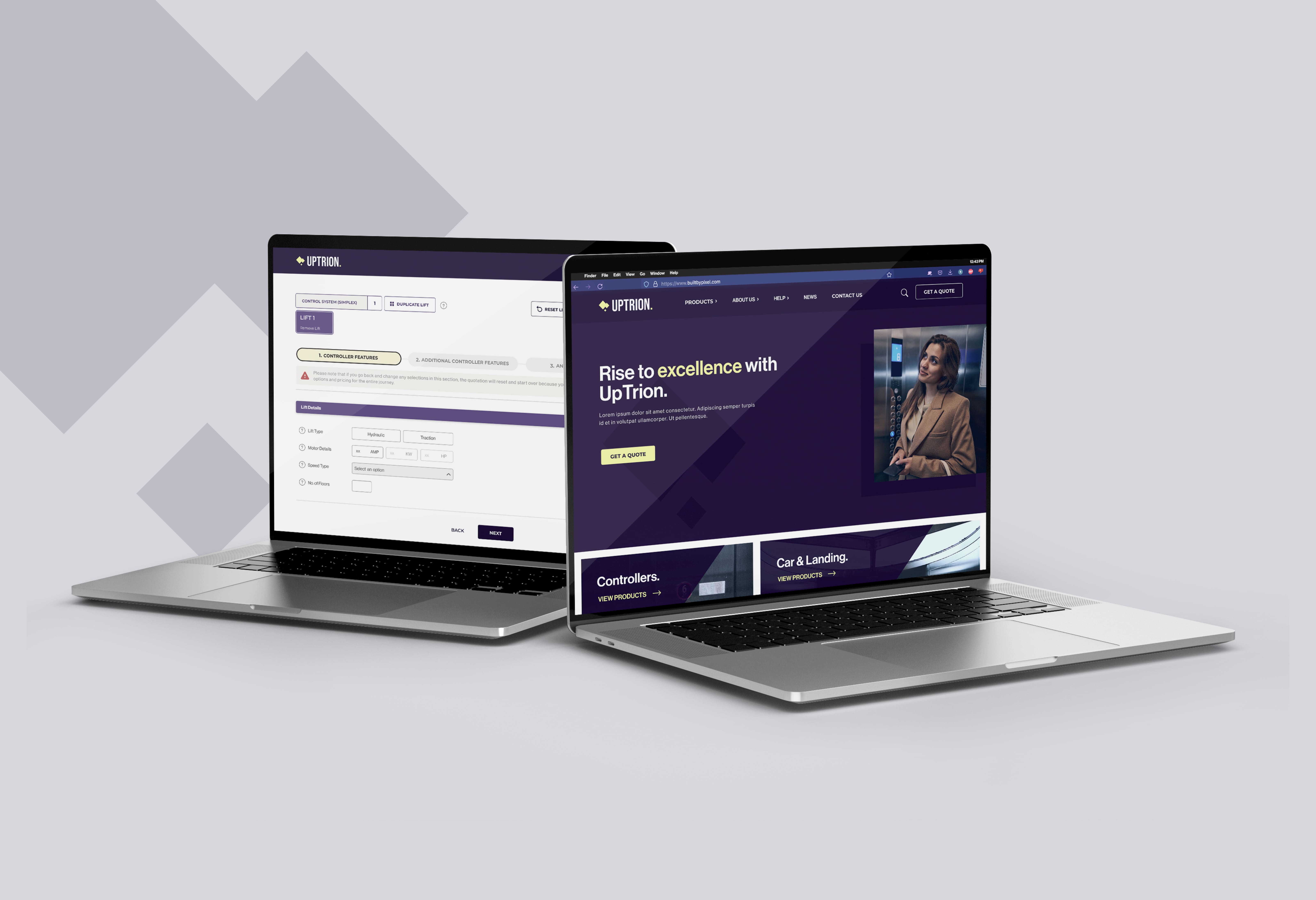
Uptrion - Lift Systems
Project Duration
01/04/2024 - 15/03/2025
My Role
Product Designer
Share
Project Overview
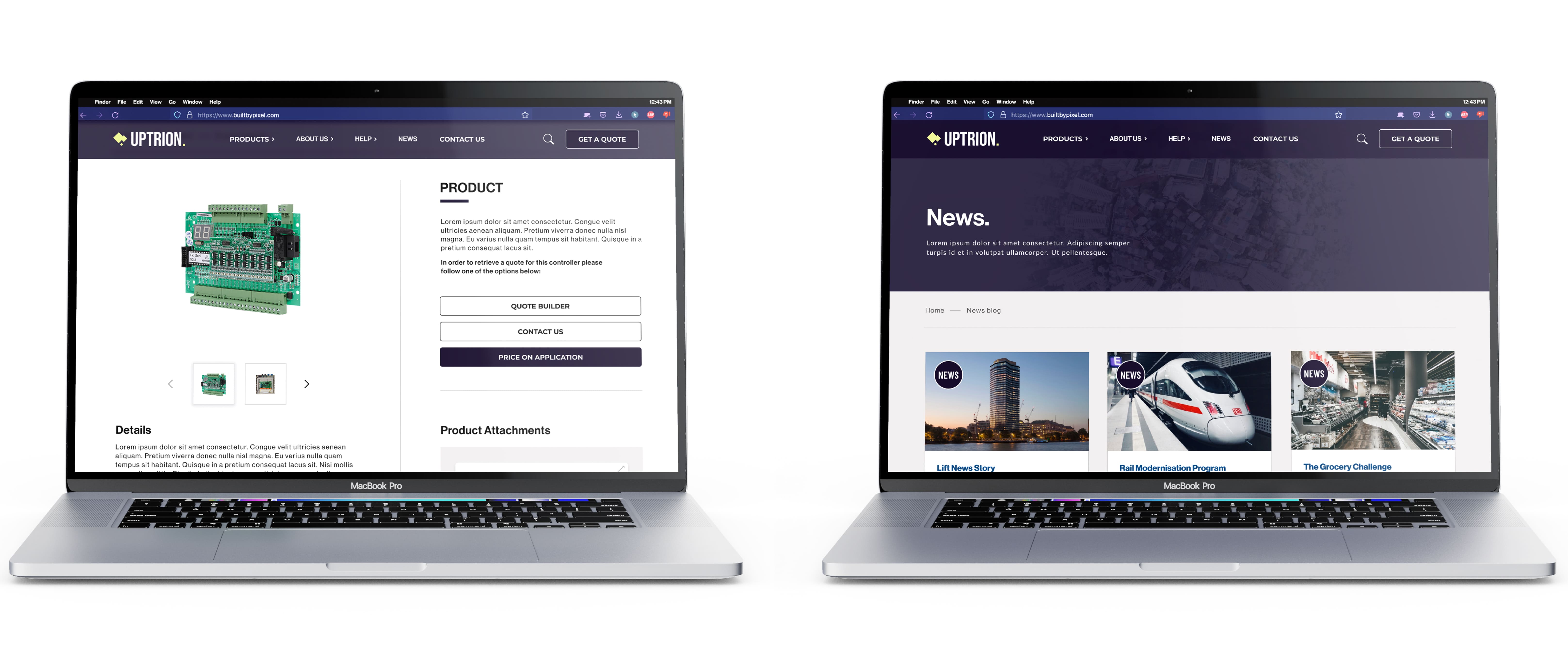
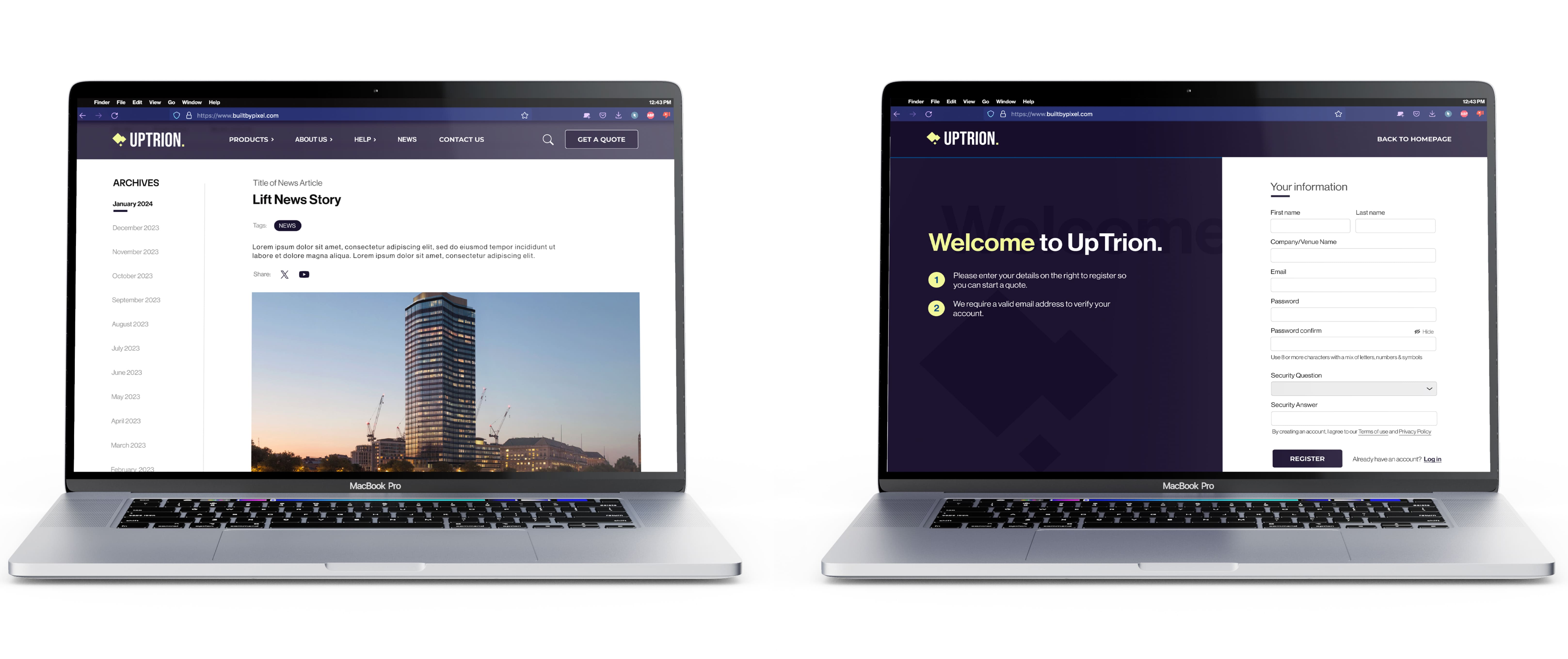
Uptrion specialises in designing and manufacturing electrical control systems, particularly for elevators. Their website, especially the quotation journey had become overly technical and confusing, causing users to abandon the process and call instead. I led a full UX/UI redesign, focusing on simplifying the quote flow, modernising the site, and improving their admin interface (Nucleus).
High Level Impact
Within months of launch, the company saw a 20% increase in sales in the first month of release, demonstrating the commercial impact of a seamless, user-focused website and quote journey. The staff also saw a 60% decrease in workflow time.

The Problem
The quoting process was hard to find, overly complex, and built for industry insiders. A redundant basket system and cluttered navigation added further friction. The wider site lacked structure and clear conversion paths.
The Goal
Redesign the quotation journey to be simple and intuitive for all users, while overhauling the wider site structure to guide users toward it more effectively. The aim was a cleaner, more accessible platform that drives engagement and reduces friction.
My Process
Every project is different, but I try to follow these guidelines if time constraints allow, depending on the goals, problems to be solved, and available resources.

Competitive Analysis
In order to better understand key objectives, user expectations, marketing strategies, and usability standards for this project, I conducted a competitive analysis of similar websites. I initially reviewed direct competitors in the lift and elevator control systems space, but quickly found that many of their quote processes were either outdated or extremely technical.
To expand my research, I later explored quote-heavy industries like insurance (e.g. GoCompare), where complex journeys are broken into simple, step-by-step flows, a useful model for tackling Uptrion’s technical process.

Research Goal
The main research goal was to uncover the major pain points users faced on the current Uptrion website, particularly within the quotation journey, and to identify opportunities to simplify and modernise the overall experience.
Specifically, research aimed to answer:
Why users were abandoning the online quote process.
What aspects of the navigation and page structure were creating friction.
How users expected a complex but technical quoting system to behave.
What visual and UX/UI cues could help create a more intuitive and trusted experience.
Interviews revealed a series of key findings and pain points, which you can see summarised in the following results.
Surveys & Interviews
After initial research, I interviewed a mix of users — some familiar with standard quotation sites like GoCompare, and others more experienced with technical, engineering-focused journeys. Surveys were also run to validate assumptions, highlight major pain points with the existing site, and gather ideas for making the new experience simpler, clearer, and more efficient for both types of users.

Early Proposals and Concepts
Initial concepts for the main site focused on:
Clearer entry points into the quote journey from homepage banners and key product pages.
Merged redundant pages and simplified navigation; moved legal links to the footer.
Removed the broken basket model and guided users directly into quoting from products.
Cleaned up page layouts, removing dead-ends and unnecessary clutter.
Introduced visual enhancements like hover states, progress indicators, and basic animations.
For the quote journey:
Broke down the complex multi-phase flow into smaller, guided steps.
Planned dynamic updates for selections and pricing based on earlier choices.
Highlighted selections and dependencies more clearly using color and visual cues.
Built a structured flow that would reduce confusion and keep users moving forward.
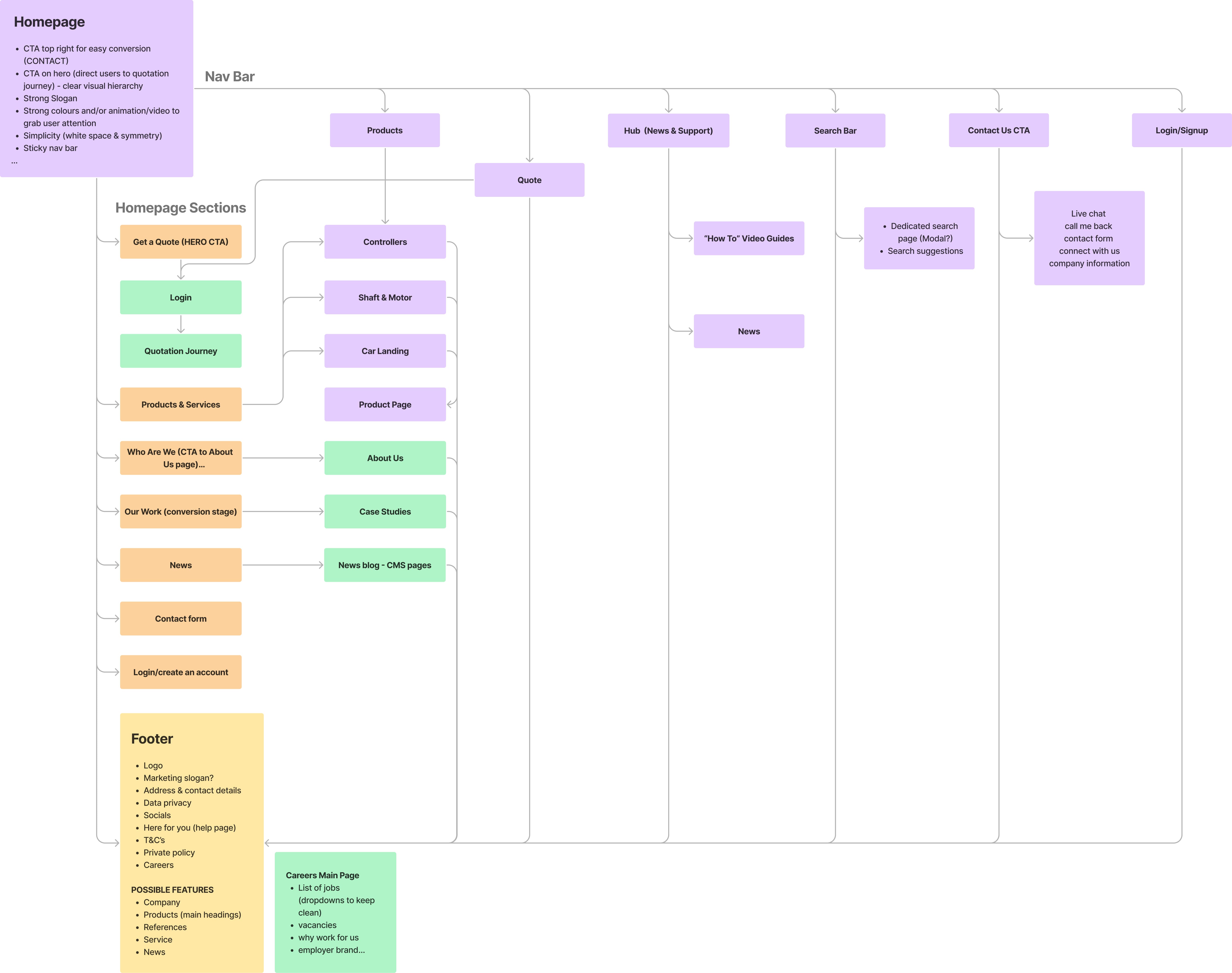
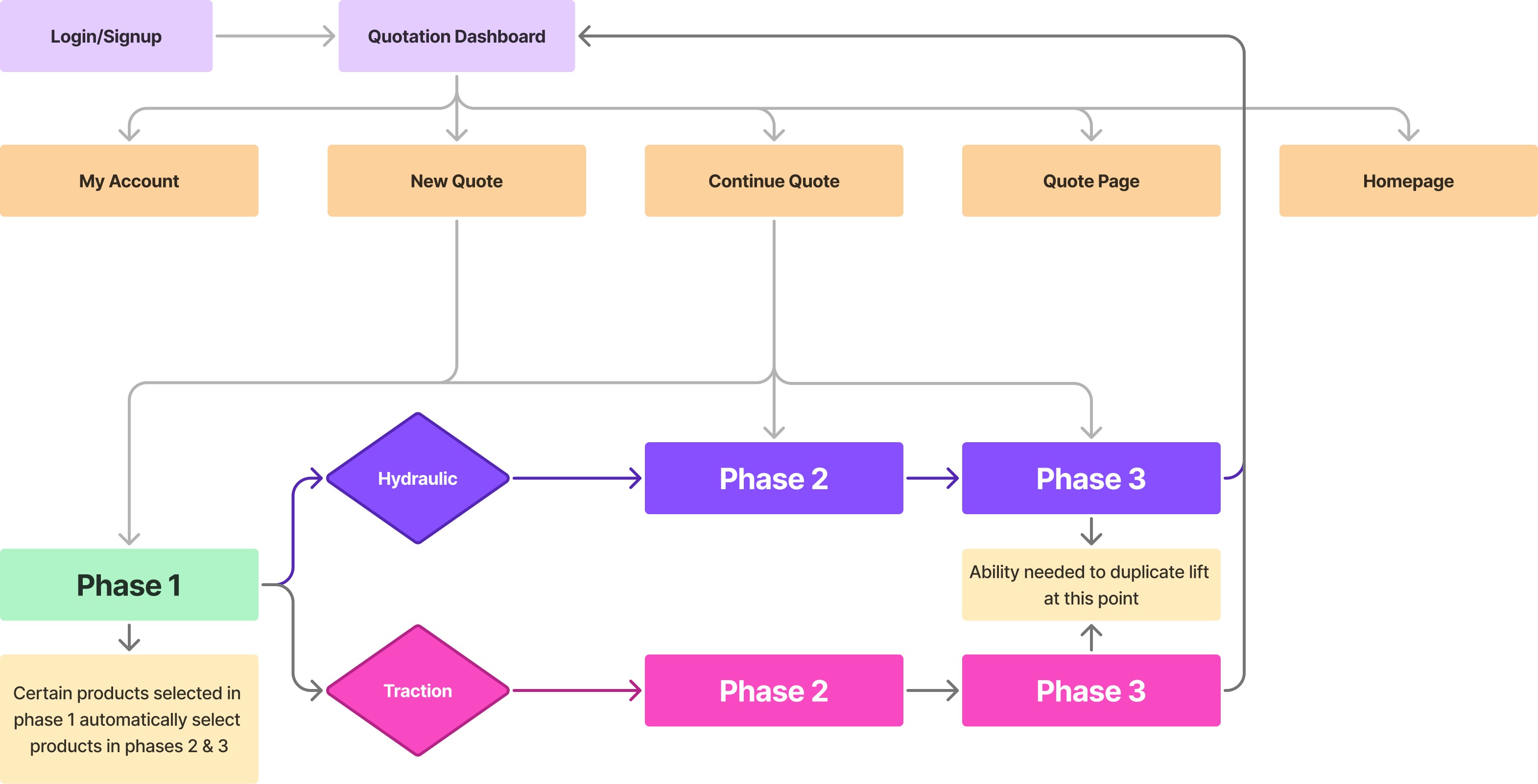
Flowcharts
Below are some flowcharts, which detail some of the key user flows throughout the site, as well as in the quotation journey. When moving into the development phase of this app, flow charts like this will lower the workloads for engineers/developers & highlight any problems that may be present.
[ Main Site ]
[ Quotation Journey ]
Early in the process, users choose between hydraulic or traction lift types in section one. This decision determines which path the quote journey takes, as each type has its own unique set of steps, requirements, and components.
Complexity
While working on the design for both the main site and quote system, the complexity grew significantly as can be seen by the screenshot of the wireframe prototype below (see below). To keep things focused, I'll be highlighting a few key features that were central to the user experience.
[ Wireframes Prototype ]
Starting The Quote Journey
One of the biggest challeneges for designing the quote journey was bridging the gap between the engineers’ technical language and UX design. I didn’t have an engineering background, so understanding the complex lift terminology was tough, and the engineers didn’t fully grasp UX. The drawings they provided were hard to follow, and the new quote journey was so different from the old one that I couldn’t rely on previous designs.
Here are some of the early sketches from the engineers, which I had to make sense of and turn into something workable.
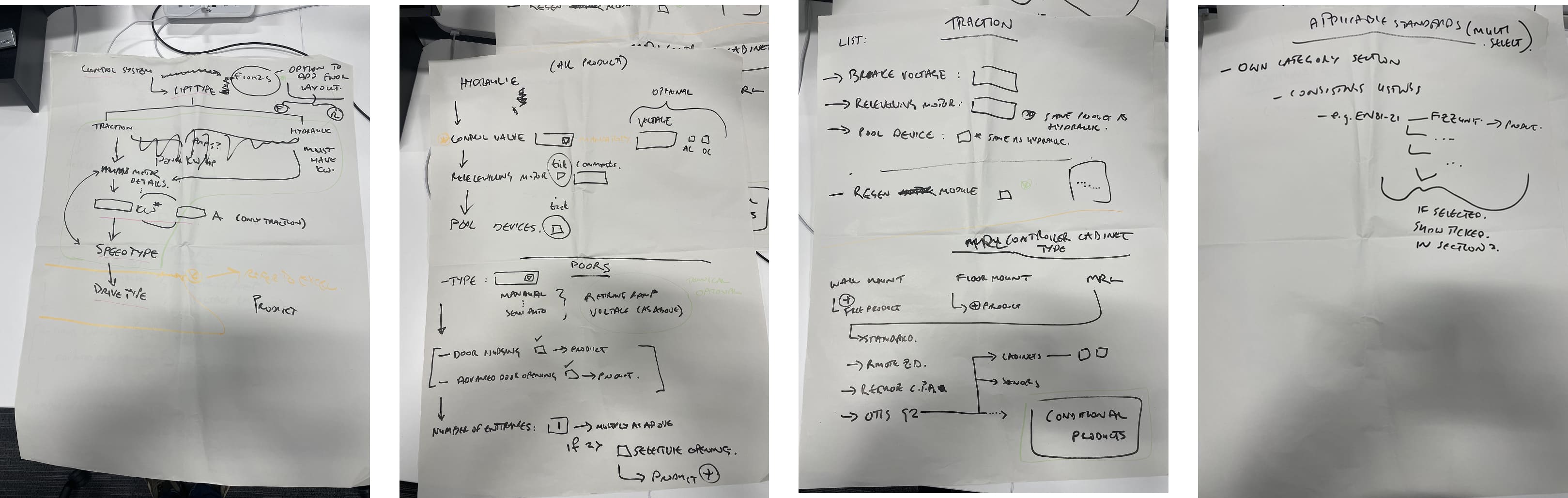
[ First Thoughts ]
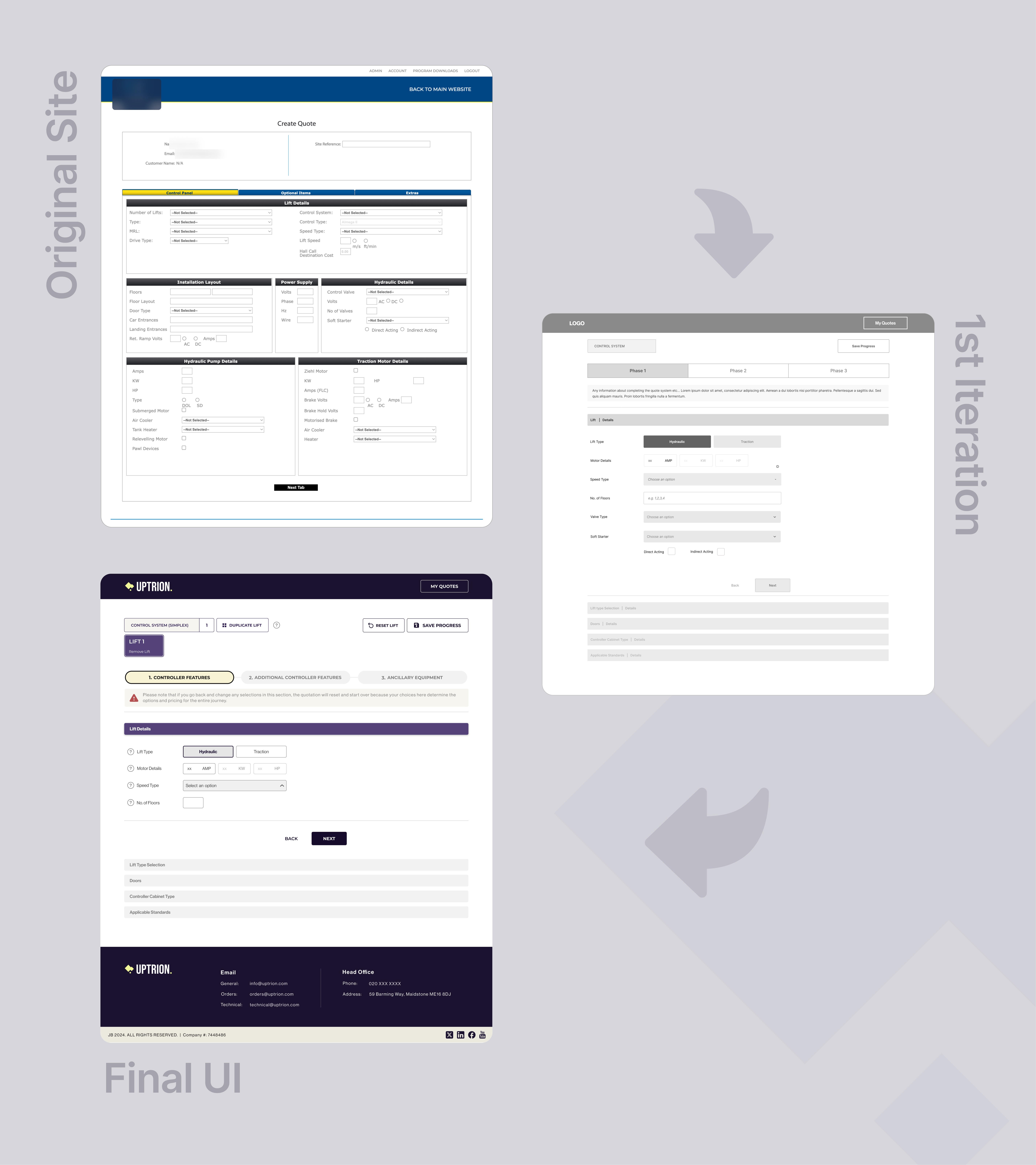
1st Iteration - Quote Layout Overview
After recovering from those engineer sketches, I focused on clarifying the quote flow. Working closely with the client, I redesigned the journey into a guided three-phase process that helps users confidently build an accurate lift configuration.
As shown in the comparison below, this iteration was a complete overhaul of the original experience. The new layout introduced a structured, step-by-step flow, with the first two phases required before progressing. Early decisions such as selecting a product in Phase 1 automatically add required components later in the journey, reducing errors and manual effort.
Clear progress indicators and a familiar, insurance-style flow made the experience more predictable, efficient, and easier to understand.
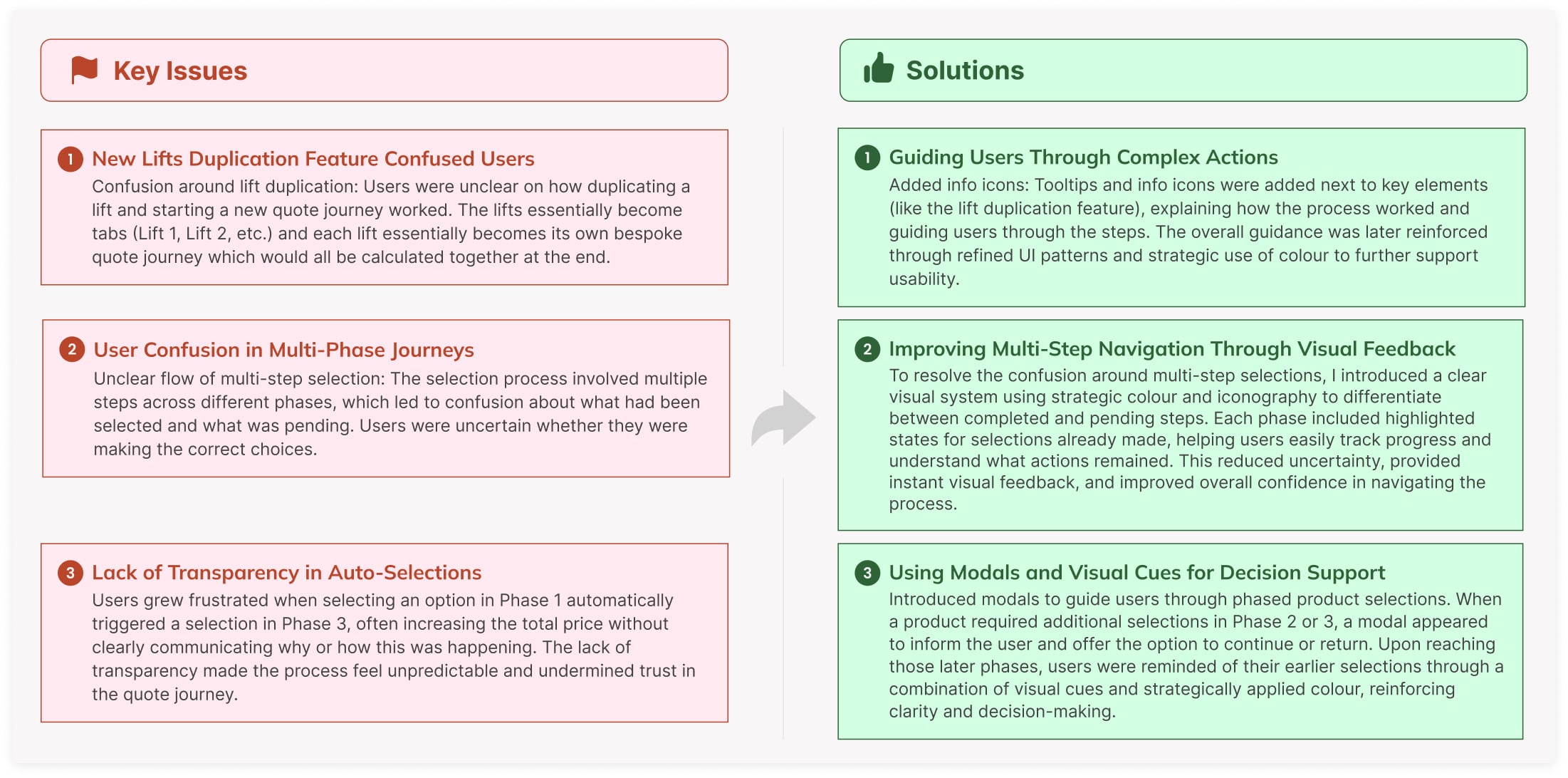
Early Curveball!
After the first iteration, testing revealed additional features that needed to be addressed:
Multi-Lift Duplication
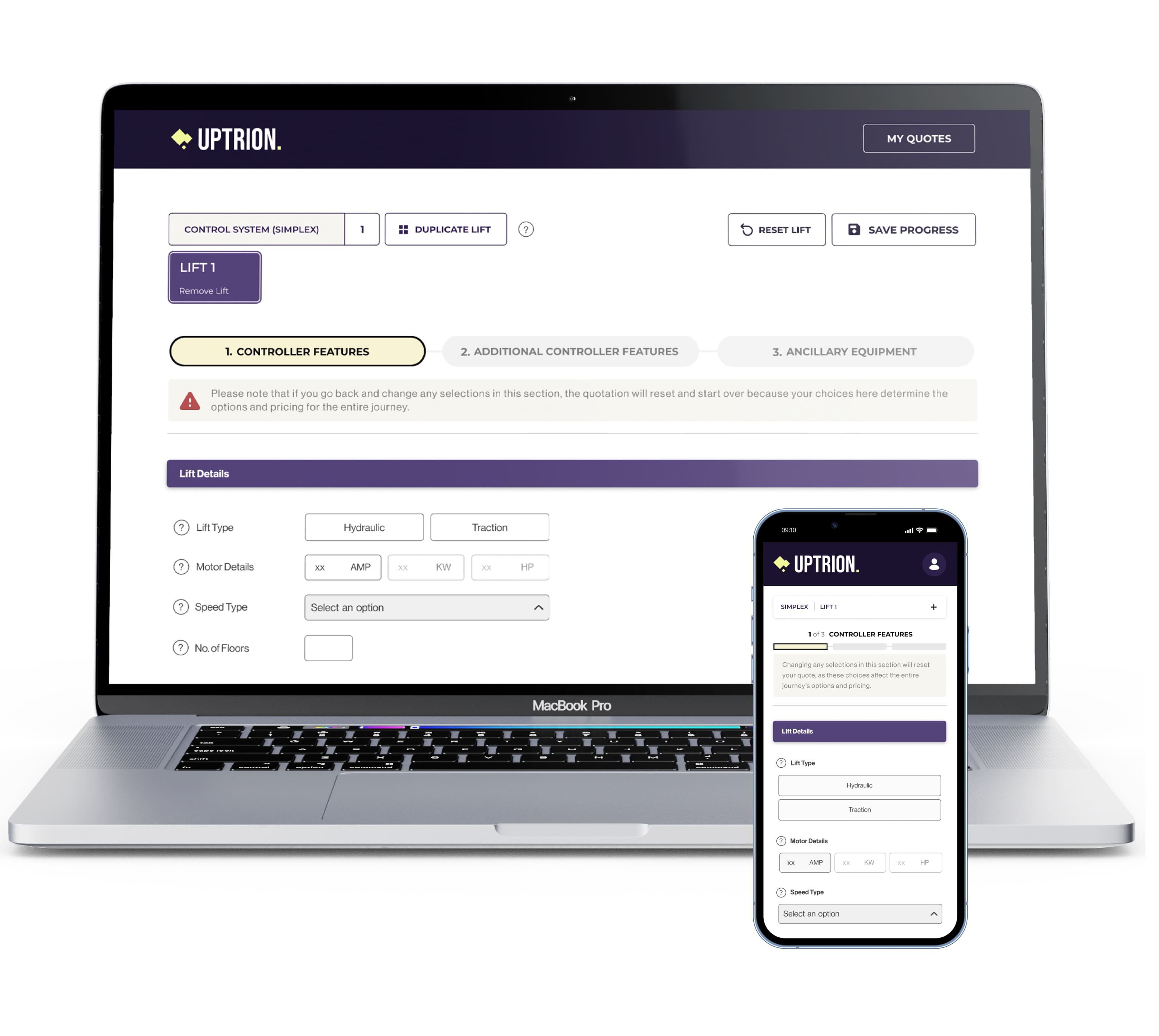
Midway through the project, the client requested the ability to quote multiple, often identical, lifts within a single quote. I designed a system using lift icons at the top to represent each configuration. A key constraint was that lift duplication could only happen after phase 2 of 3, once enough data existed to clone. If a user tried to add a lift earlier, it would start a fresh configuration instead. This limitation shaped both the UI logic and how we guided users to avoid confusion.
[ Lift Duplication ]

[ Results ]
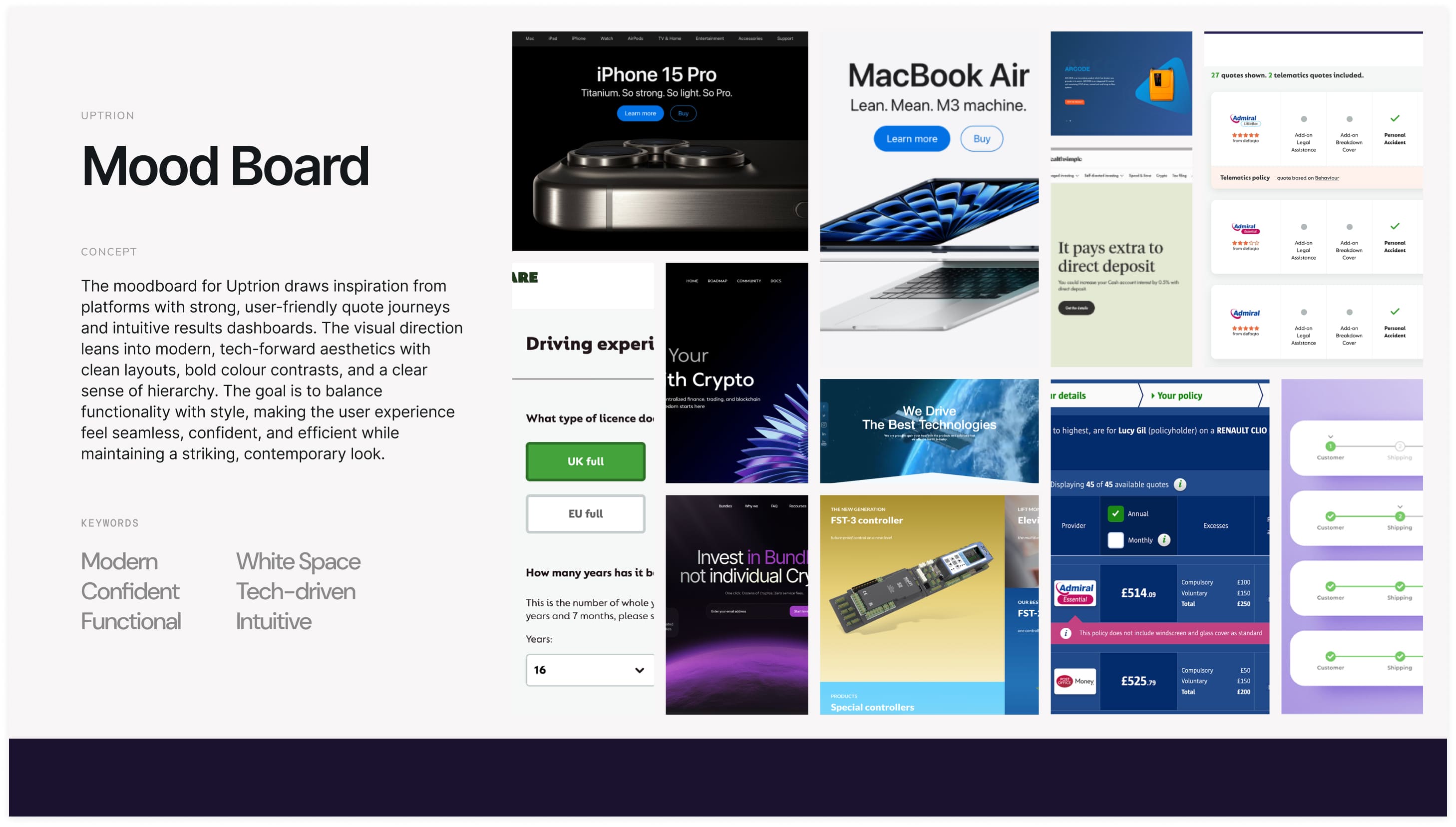
[ Inspiration ]
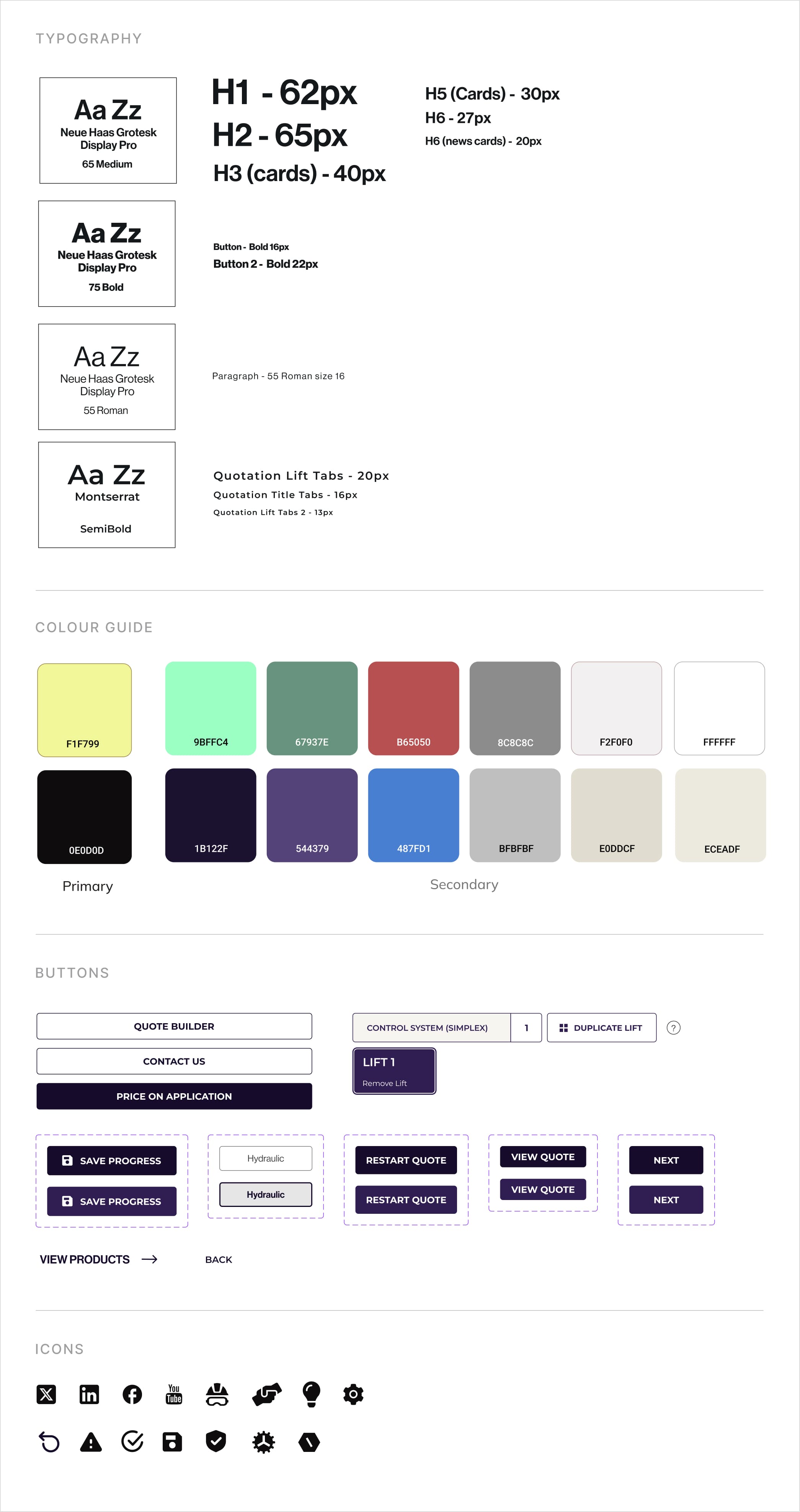
Style Guide
This style guide functions as a foundational component of Uptrion's design system, offering developers a consistent reference for implementation. All colour combinations on the site pass the WCAG AA guidlines.
As part of the design system, it ensures a scalable, consistent interface and streamlines future development and updates.
Problems Solved With UI
Smart Reset Flows for Incompatible Changes
When users attempted to change early decisions that affected the entire configuration, the system triggered warnings and fallback flows. These ensured users understood when a full quote reset was required, helping manage expectations and maintain system integrity.
[ Start - Hydraulic/Traction ]
Guided Product Selections with Modals
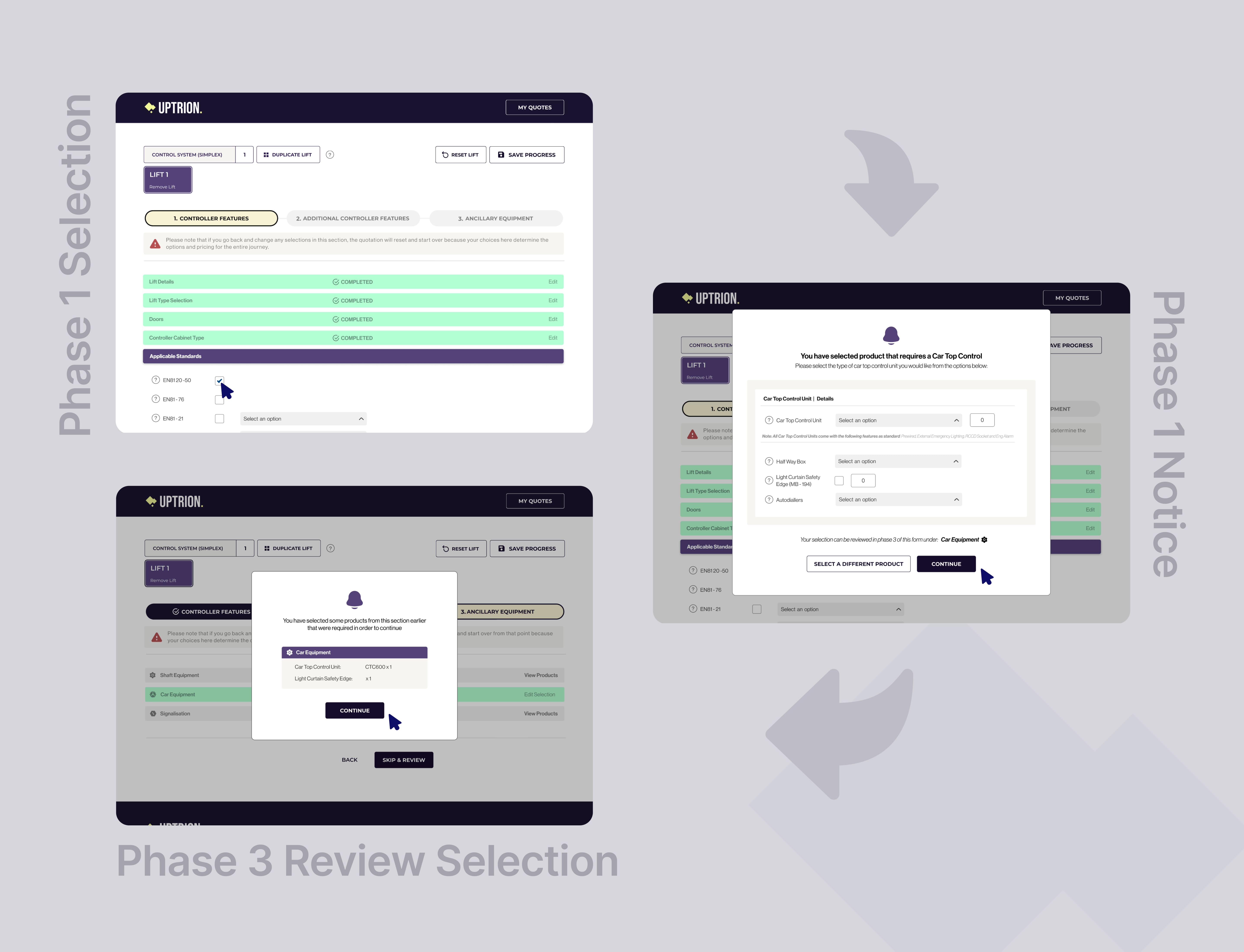
To manage complex dependencies between lift configuration phases, I introduced modals that alerted users when a selection required a product in a later step (e.g., selecting Product A would require Product B later). These modals provided clear options to continue or go back, while visual cues and color reinforced awareness of earlier choices throughout the journey, helping users make informed decisions and reducing errors.
[ Modals To Clean Up Selections ]

Outcomes
Following high-fidelity testing, the new design performed exceptionally well. The quote journey received a 5/5 rating from 100% of test users, who found it significantly easier to use than the previous version. While usability issues were minimal, I introduced microinteractions across the site, including hover states, button feedback, and smooth transitions, to create a more modern, polished experience. These subtle enhancements improved navigation clarity and helped highlight key calls to action without adding noise.
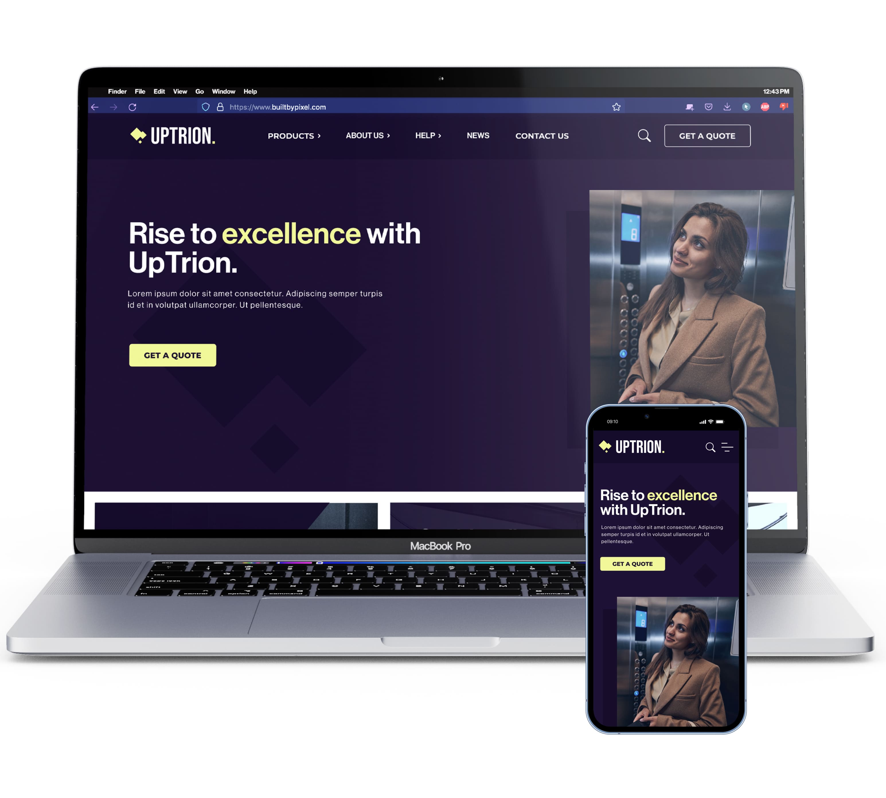
Homepage UI
For the homepage, I used a sales funnel approach to guide users smoothly through the journey. The hero section was strategically designed to direct users towards the quote process, encouraging them to start their lift configuration right away with clear CTAs.
[ Homepage ]

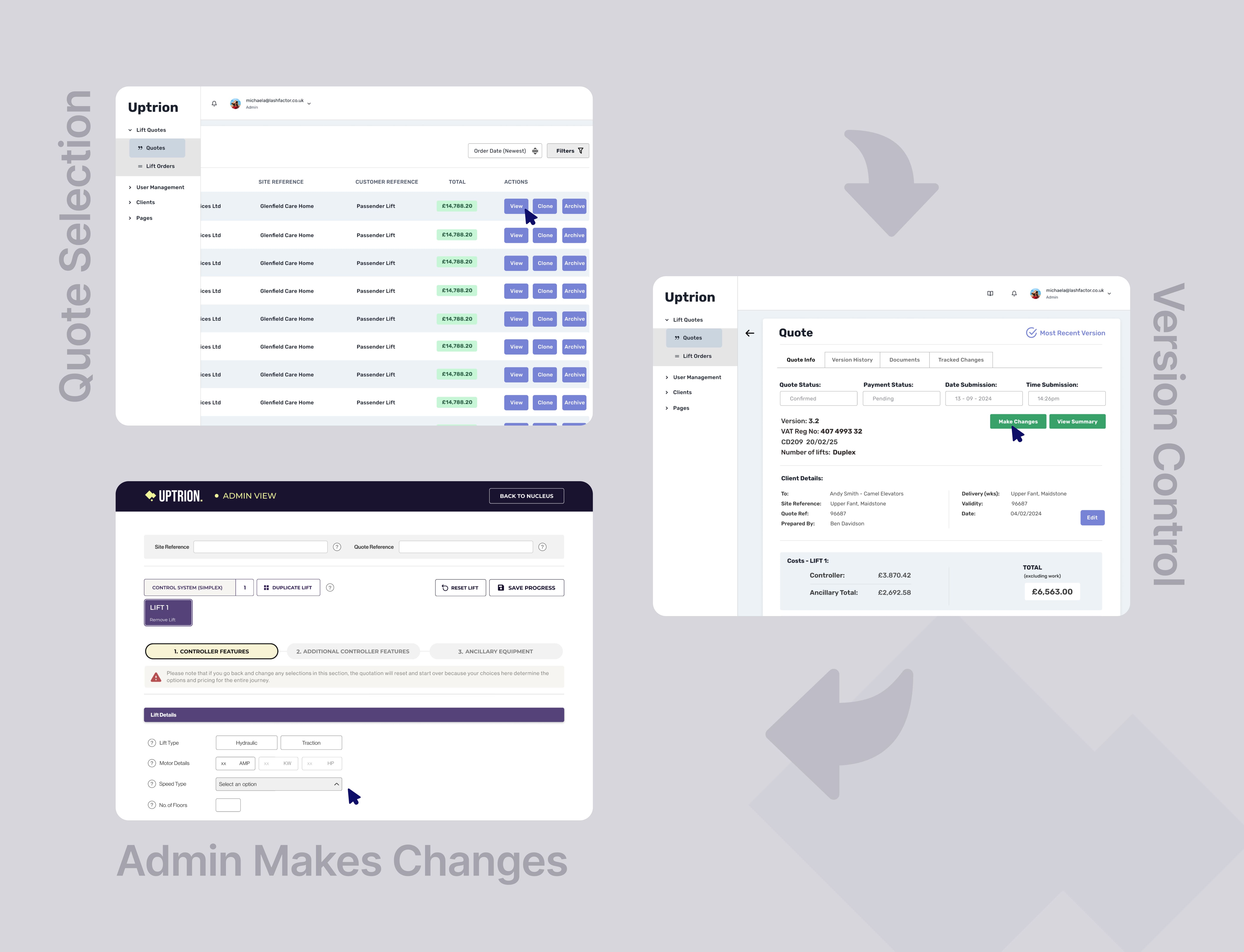
Version Control for Admin (Nucleus Panel)
To finish things off, I designed a version control system within the admin dashboard to manage quote revisions. Submitted quotes are locked and logged (e.g., Quote 1.0), while internal updates are tracked incrementally (1.1, 1.2, etc.) for full transparency. Users cannot edit submitted quotes but can duplicate them to start a new version (e.g., Quote 2.0), similar to tools like GoCompare. This approach keeps the process structured, auditable, and flexible.
[ Admin Version Control ]
[ Final UI Mockups ]
Impact
The redesign made the quote journey significantly easier to use, earning a 5/5 rating from 100% of test users. Simplified navigation, a guided quote flow, and microinteractions improved clarity, reduced friction, and increased user confidence. Following the 2025 launch, the new experience drove a 20% increase in sales.
Combined, the new quote journey and admin version control system streamlined the entire process, providing transparency and flexibility, and reduced staff workflow by 60%.
What Did I Learn?
This project taught me how to balance technical requirements with user experience, especially in complex systems. I learned the importance of clear visual cues and just-in-time guidance to improve usability. It also strengthened my ability to collaborate with cross-functional teams, turning technical feedback into intuitive design solutions.
View Prototype →
View Prototype